Aka
Tattoo Studio
2018
Tattoo & piercing studio based in Berlin
Art Direction
Concept
Branding
UX/UI
Interaction
Aka Tattoo Studio
Web design & Branding Germany
Credits
Art Direction Naiara Odriozola
UX/UI Design Naiara Odriozola
Web Development Lorena Laguarta
Photography Philip Nürnberger
Content Hannah de Graves
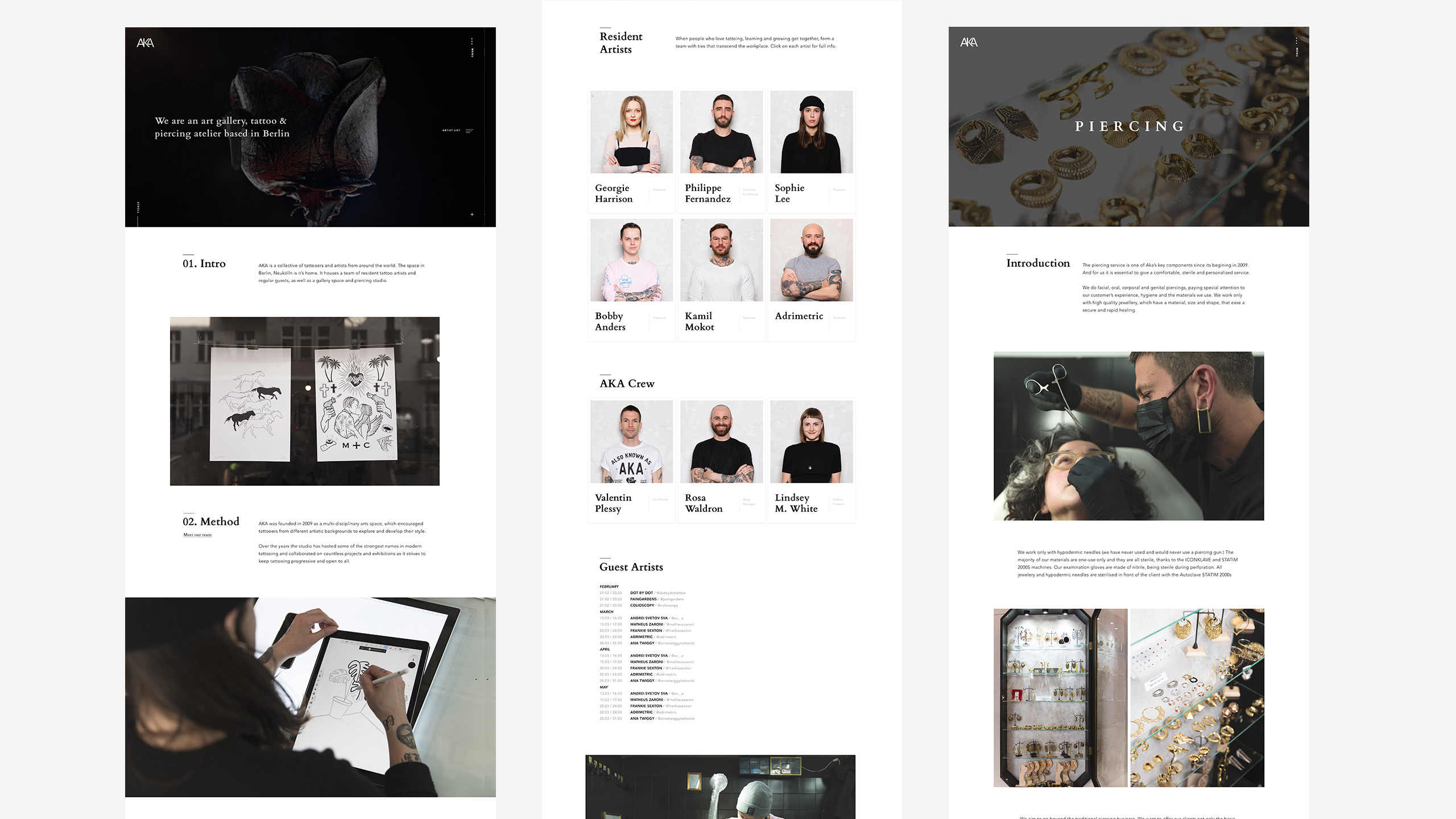
AKA is a collective of tattooers and artists from around the world. The space in Berlin, Neukölln is its home. It houses a team of resident tattoo artists and regular guests, as well as a gallery space and piercing studio.
Besides holding the underground culture of the city, the atelier collaborates with different artists to exhibit their work. The gallery has exhibited painting, photography and sculpture and has provided a pop-up retail space to various creators and collaborators.
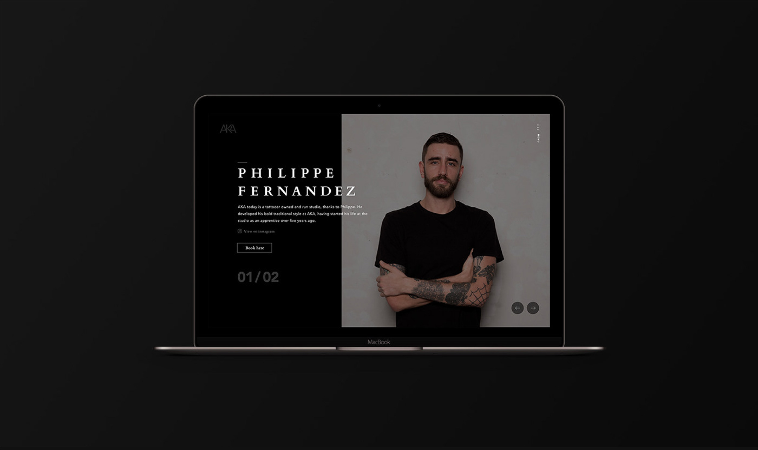
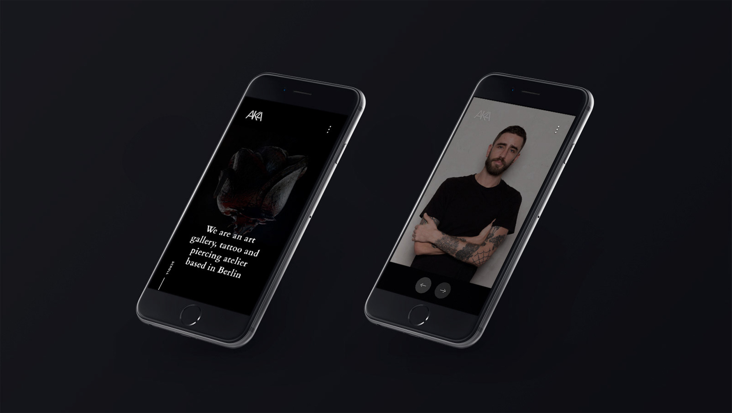
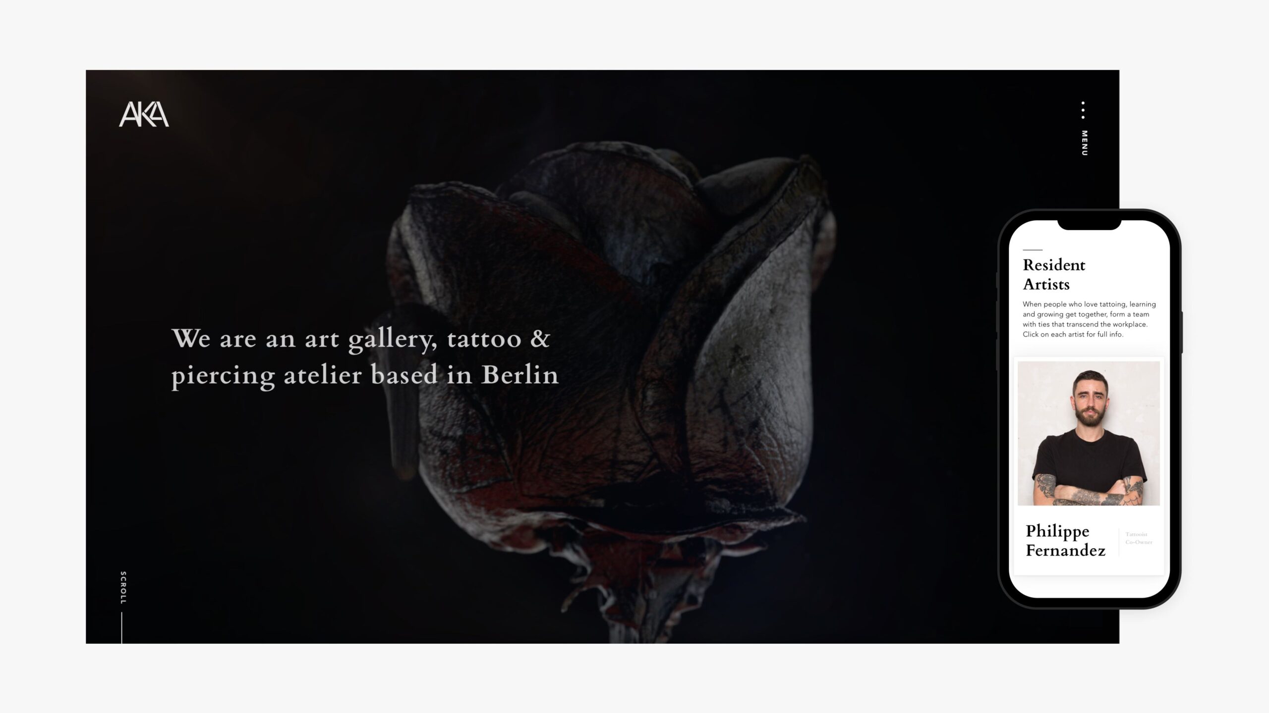
The user experience
Bringing the brand experience to the screen
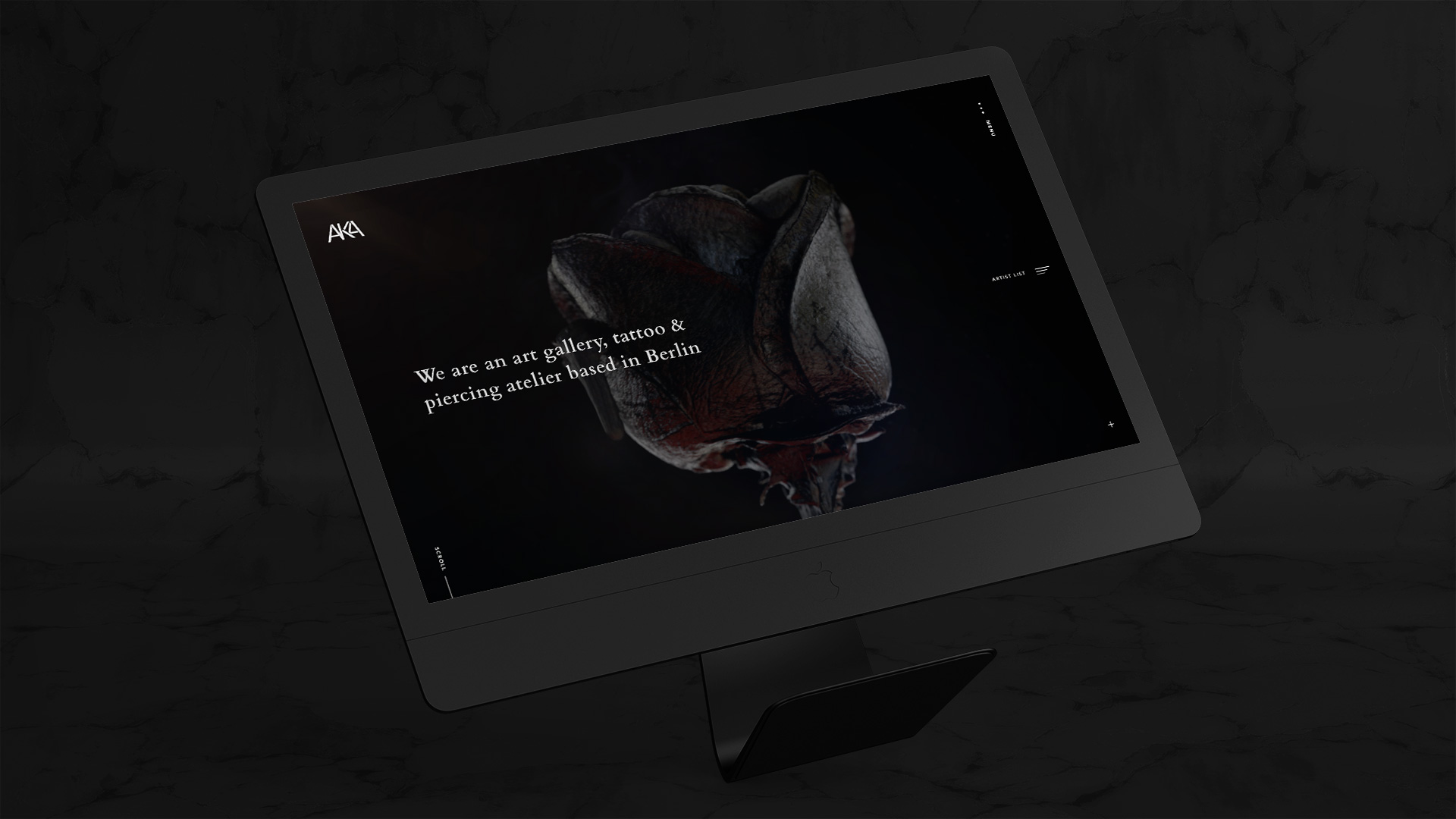
The AKA studio is unique and so is the AKA experience. We gave their website a redesign and improved its user experience. The main idea was to bridge the digital and physical experiences and create an immersive digital storefront inspired by the in-store experience.
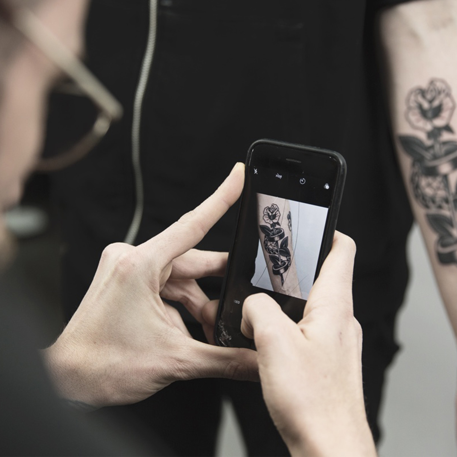
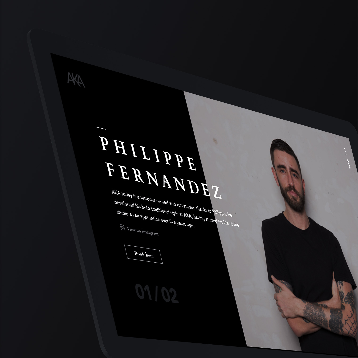
Visiting AKA involves a conversation with a tattoo artist. Each tattoo artist is trained to discover individual needs and offer tailored tattoo recommendations. The site strategy is built around AKA’s high-touch customer service. The content and imagery explain the tattoo process and skincare just like an AKA tattooer would.
Customers browse the website the same way they would in the tattoo studio—imagining how the artists' work might fit their skin—but with technology enhancing the journey.
The AKA culture & identity
A new approach to traditional tattoo
AKA has incorporated a gallery space since it’s conception. It provides a space for its tattooers to exhibit their art and also invites artists from other creative backgrounds to display their work.
While their shows and exhibitions are well known in the Berlin scene, their brand awareness was low. They needed a visual identity to complete their logo that is as inviting, creative and bold as they are. For that, we distilled the essence of the brand down to its core elements. AKA's sense and love for traditional tattoo was represented in the typography by the font Cardo. Cardo is a high-quality Old Style font that represented their love for tradition in a contemporary manner. The colours were kept in Charcoal and Frost white as only traditional blackwork is done in the store.
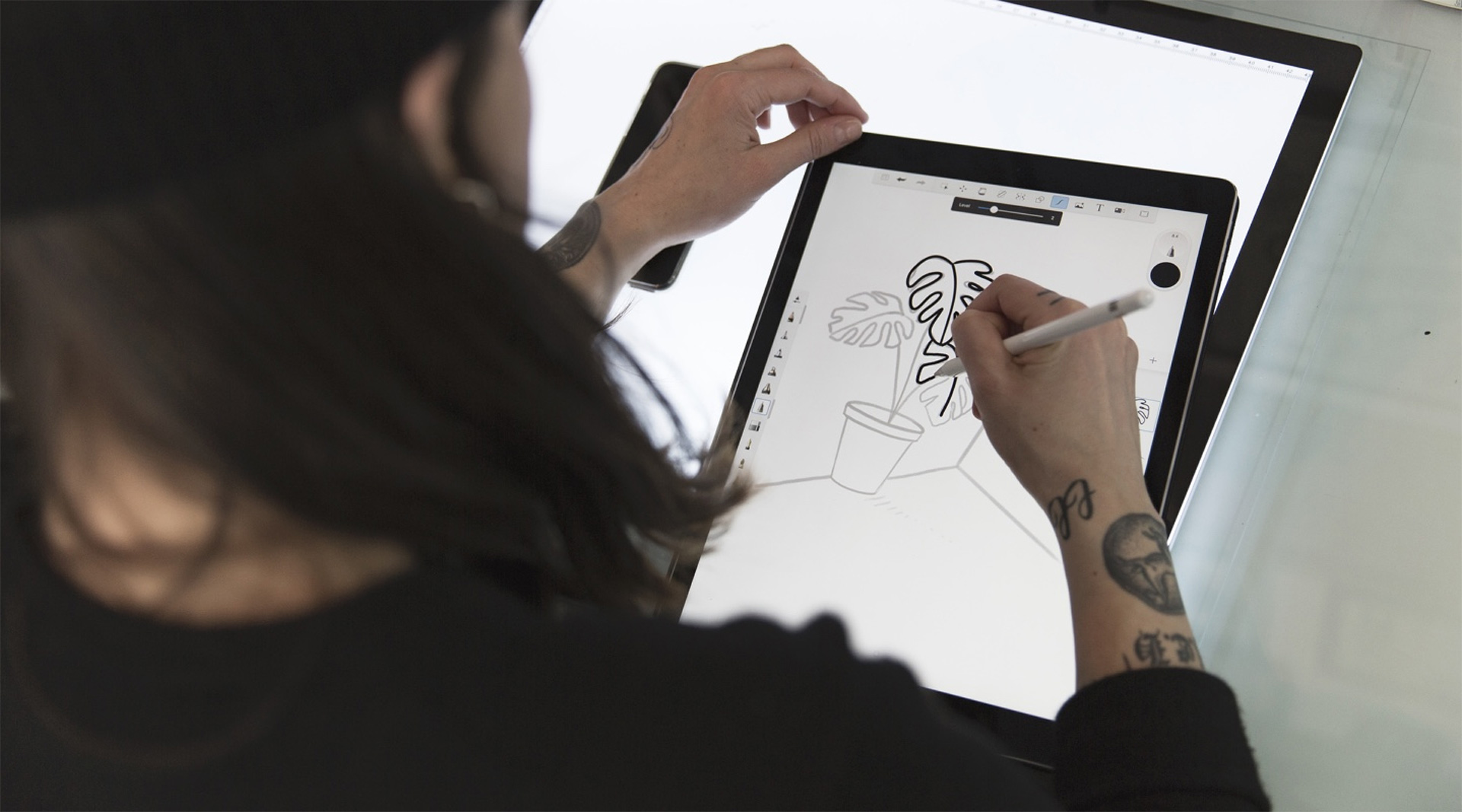
The interface design
Built with a love for design
The AKA website borns out of love for aesthetic design, passion for functionality and structure. The sophisticated and innovative design merges with the elegant motion design creates calm transitions that mirror a relaxing in-store experience.
We included best accessibility practices into the design components and ensured our digital products are natively inclusive.
Let's collaborate
hello@naiaraodriozola.com
Copyright © 2026
Development
Made with Semplice
by Naiara Odriozola