Bookwire
Digital Publishing
2019
New website for Bookwire
User research
Concept
Digital Branding
UX/UI
Interaction
Motion Design

Bookwire
Web and app redesign Germany
Credits
Creative Direction Markus Kleine-Vehn
Head of UX Design Naiara Odriozola
Responsive UI Design Naiara Odriozola
App UX & Design Naiara Odriozola
Agency think moto
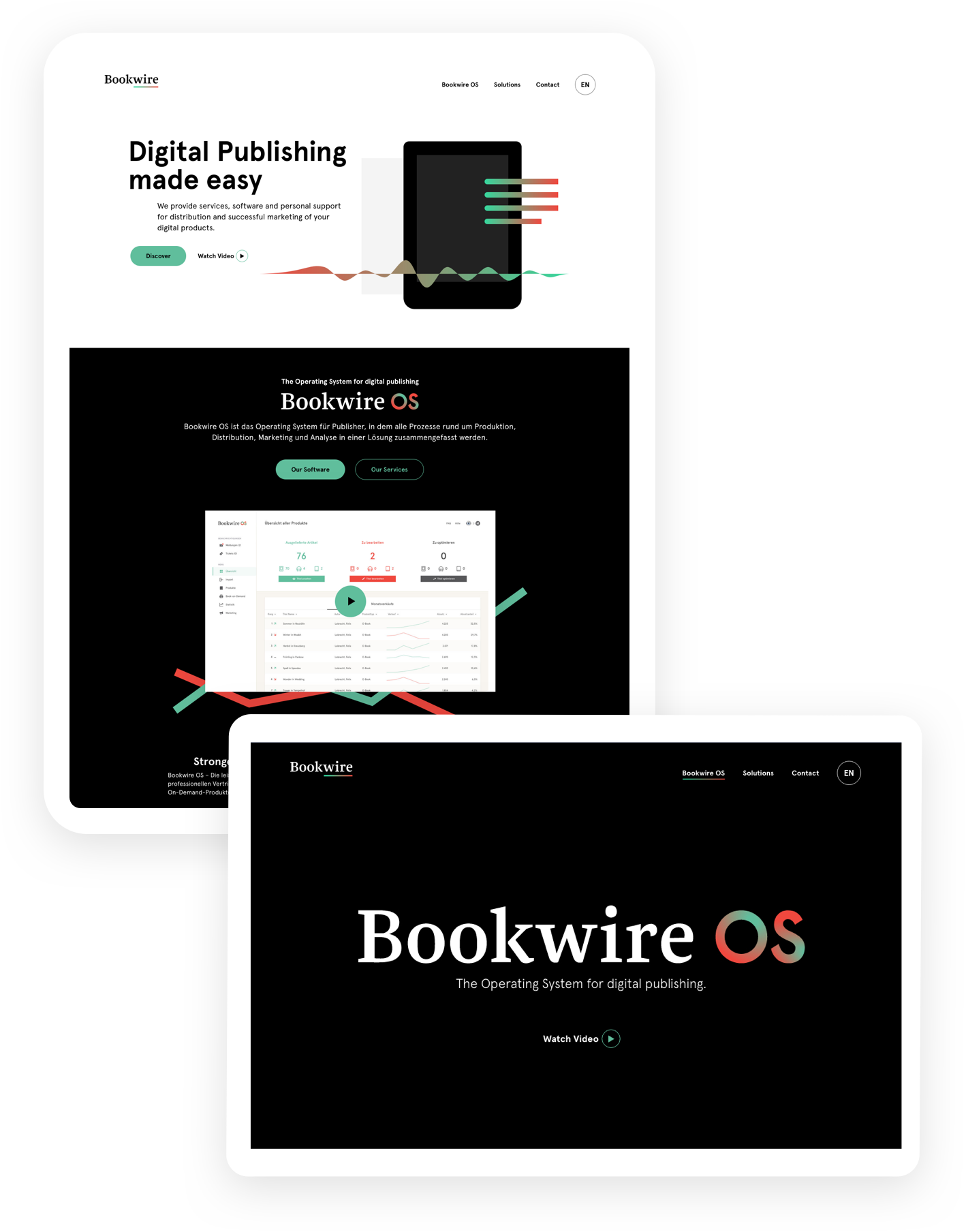
Bookwire is the leading solution for the production and distribution of eBooks, audiobooks and podcasts. Following the lounge of their new identity, the client asked us for the redesign of their website and Bookwire OS software interface.
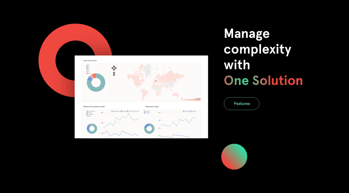
The challenge in this environment was to communicate non-visual processes and advantages of a software in an emotional and sophisticated way.
The user experience
Bookwire but more grown up & experienced
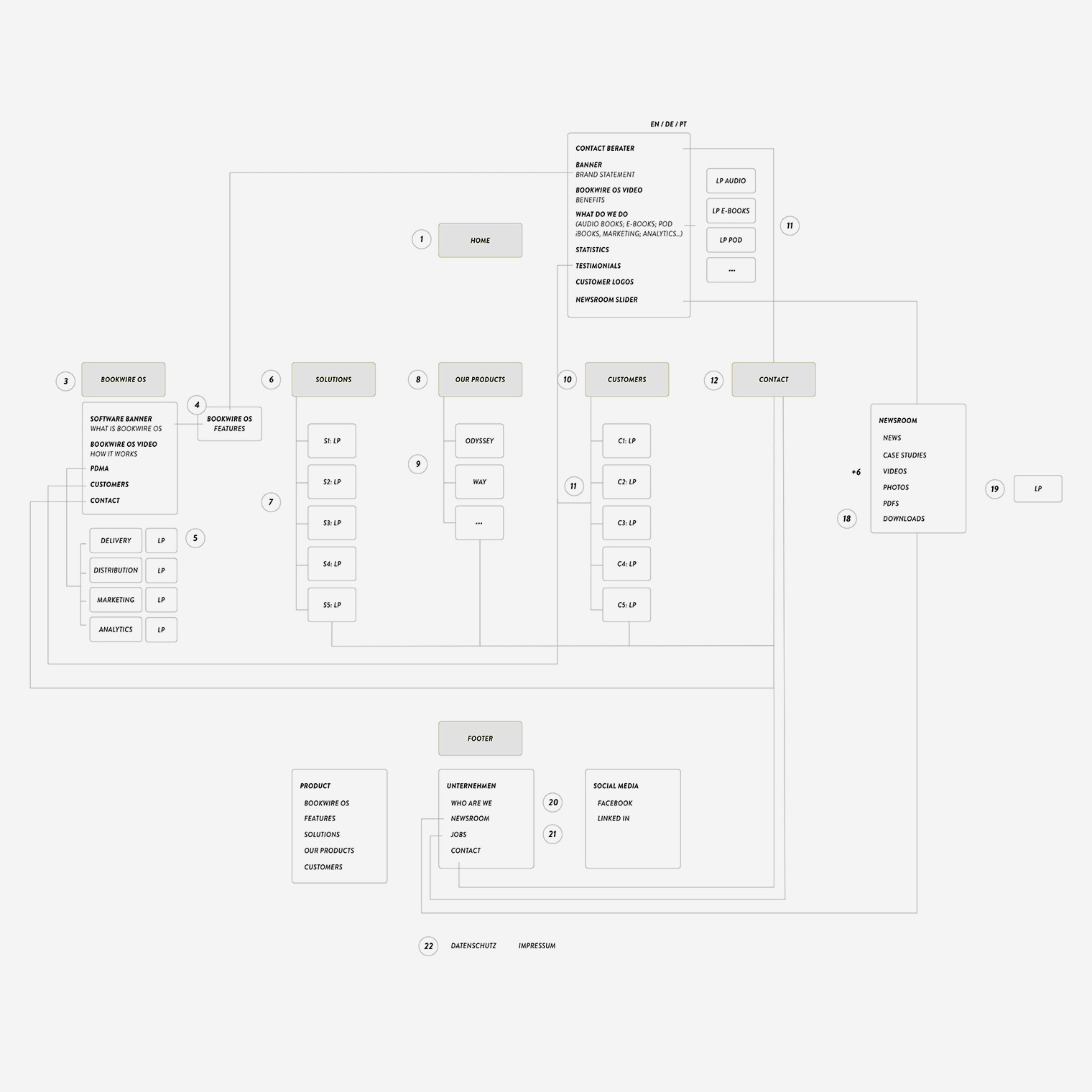
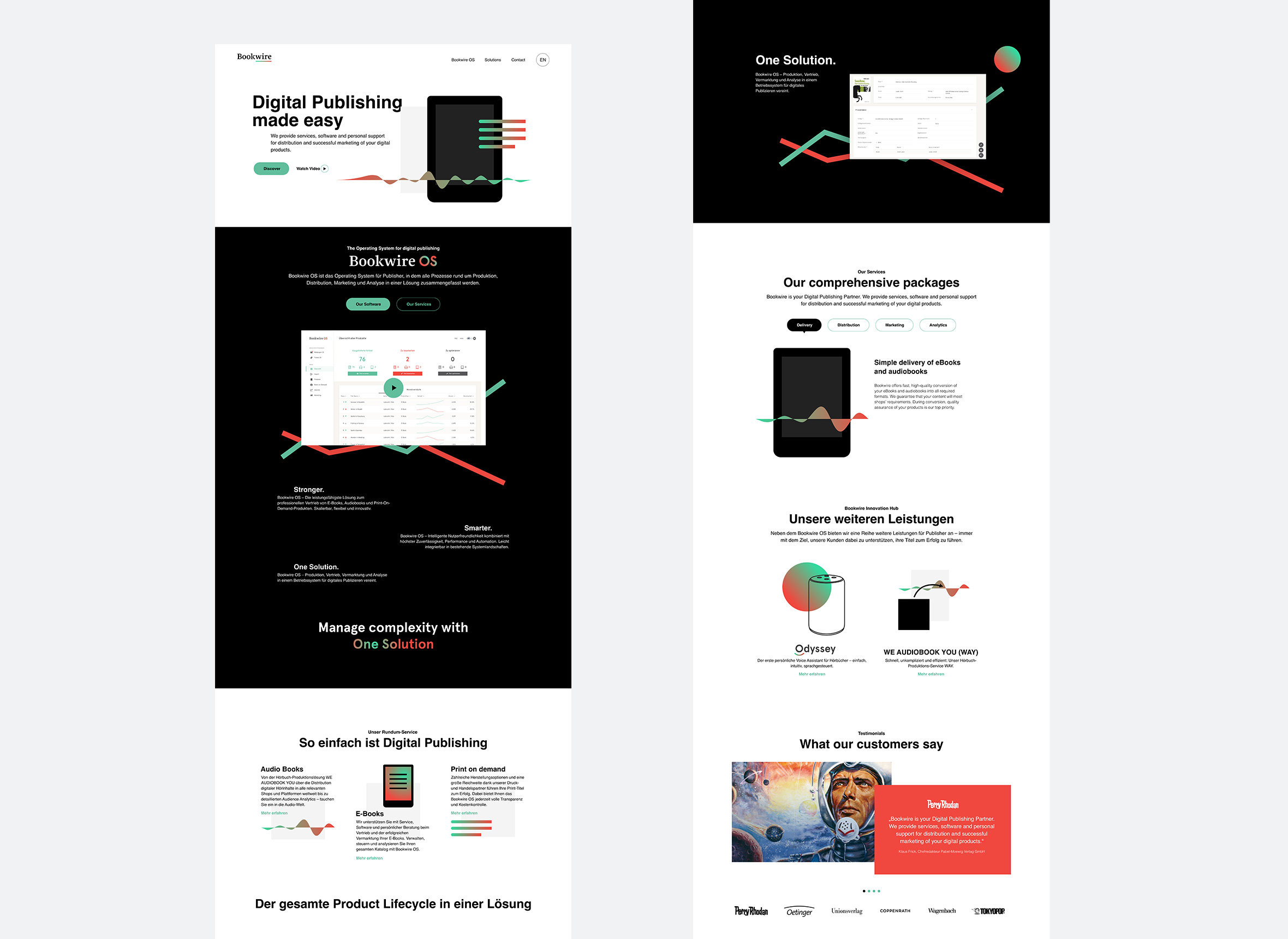
Since the beginning of our collaboration, the company had not only grown, but also become more international and self-confident. In addition to a new information architecture we rounded the UX strategy off with the latest UX principles.
After a discovery workshop were we gathered user and stakeholder feedback, I created the sitemap, flows and wireframes. We tested our prototype to validate the wireframes. The website would be the main pillar of the new identity.
The user interface
From idea to execution
Starting from the redesigned product logo in the context of the updated software from Bookwire Macs to Bookwire OS in 2019, think moto developed a consistent language for the logo family of the company and its software products.
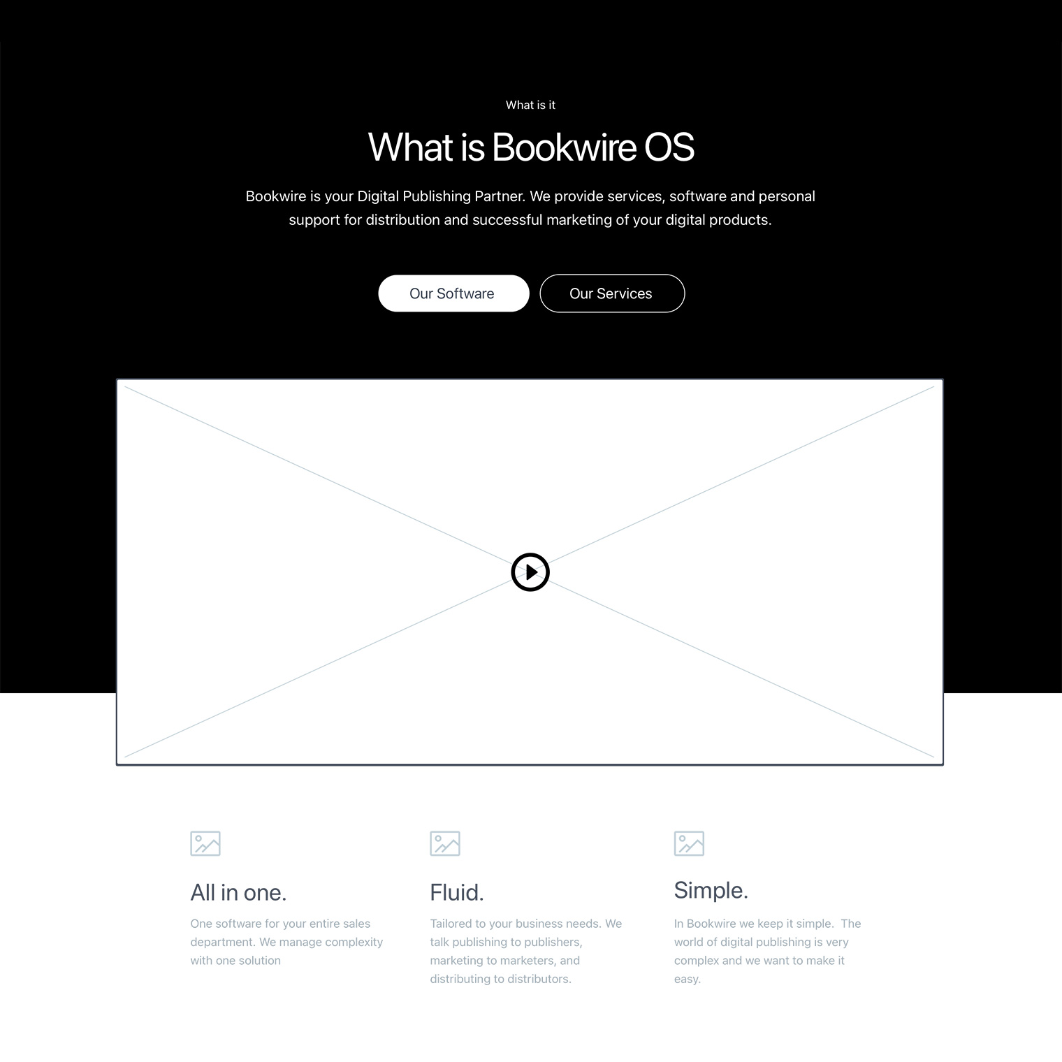
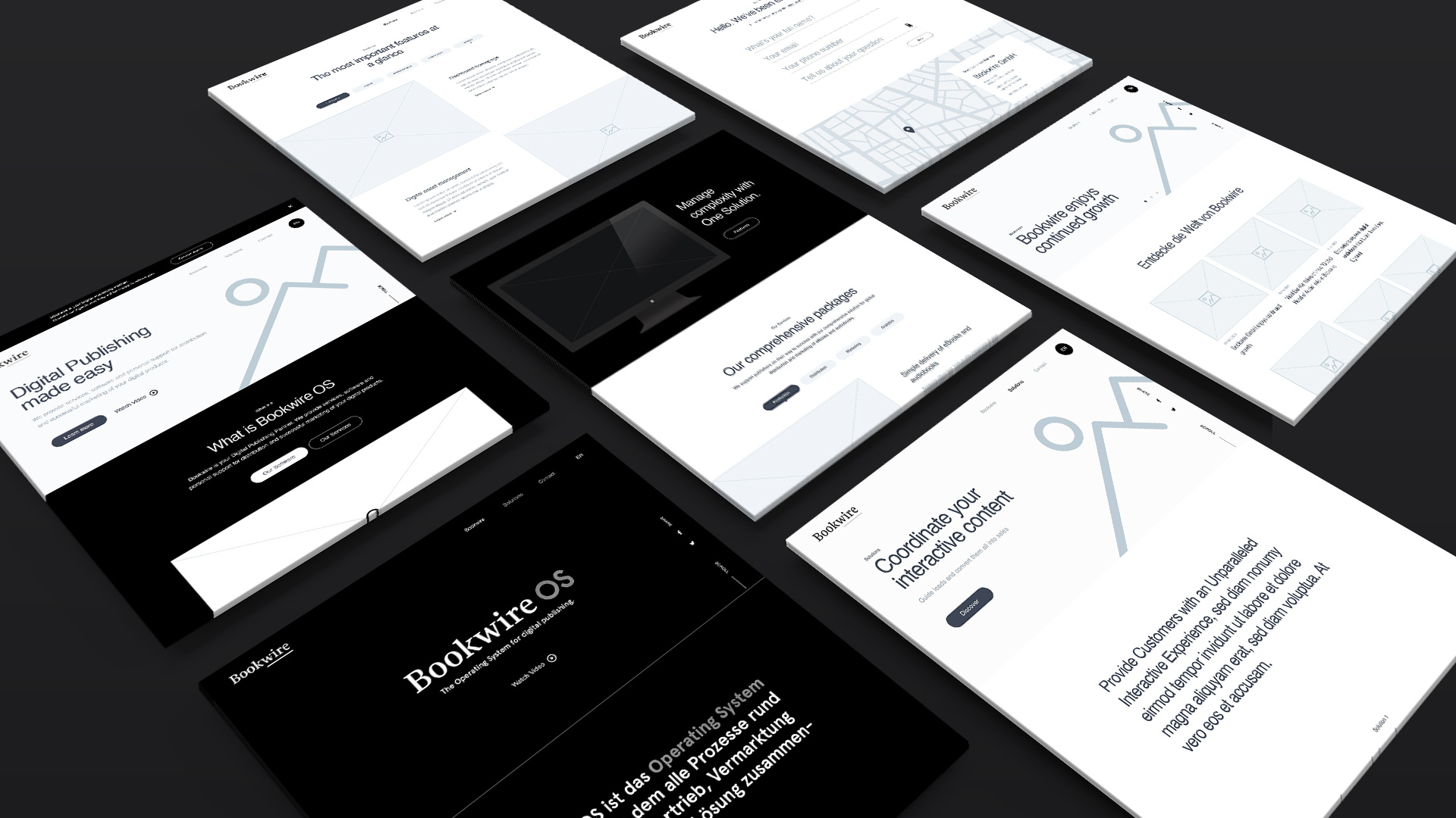
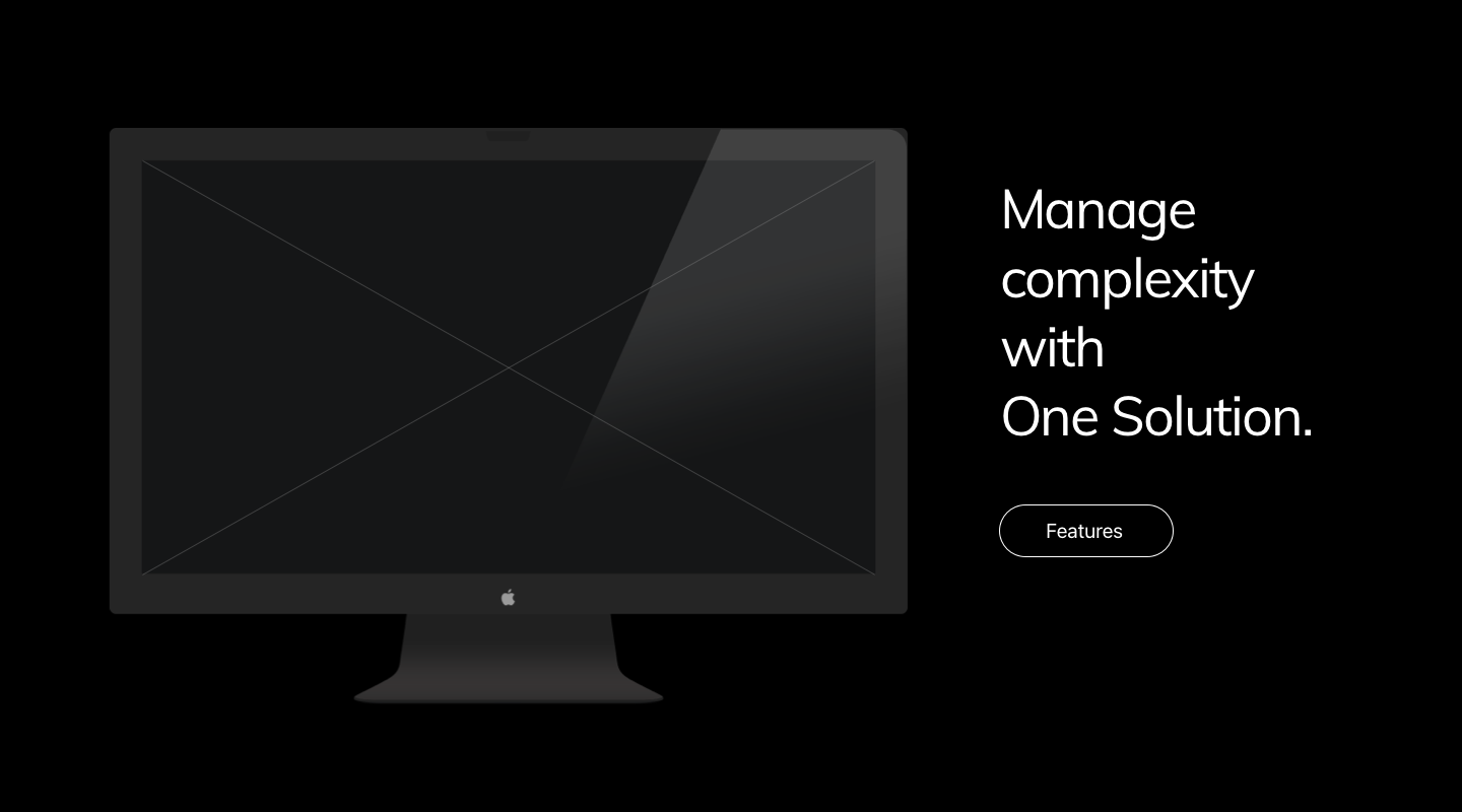
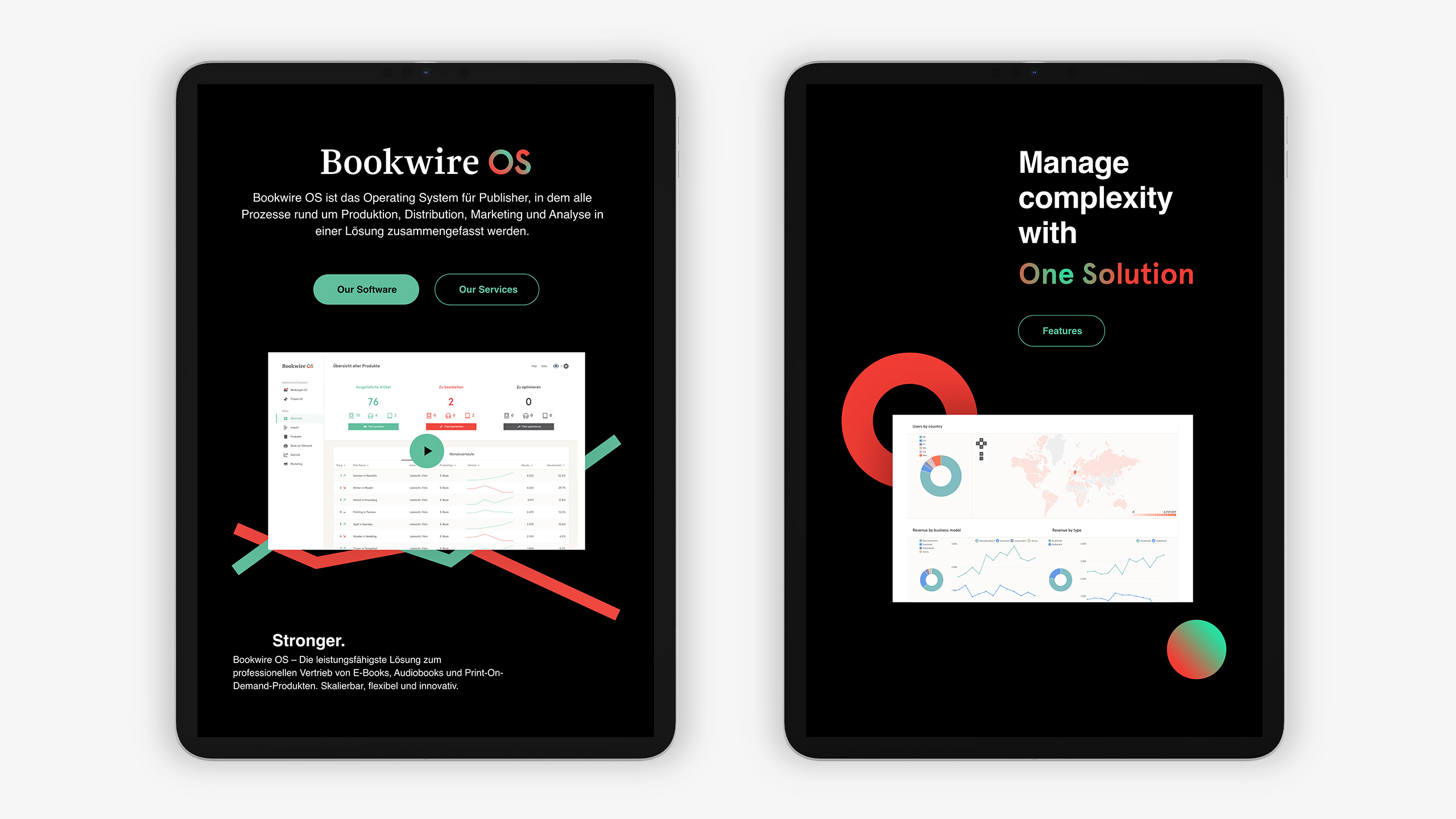
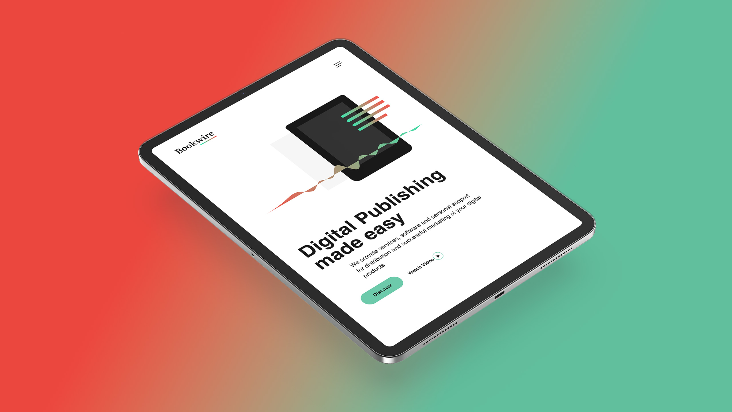
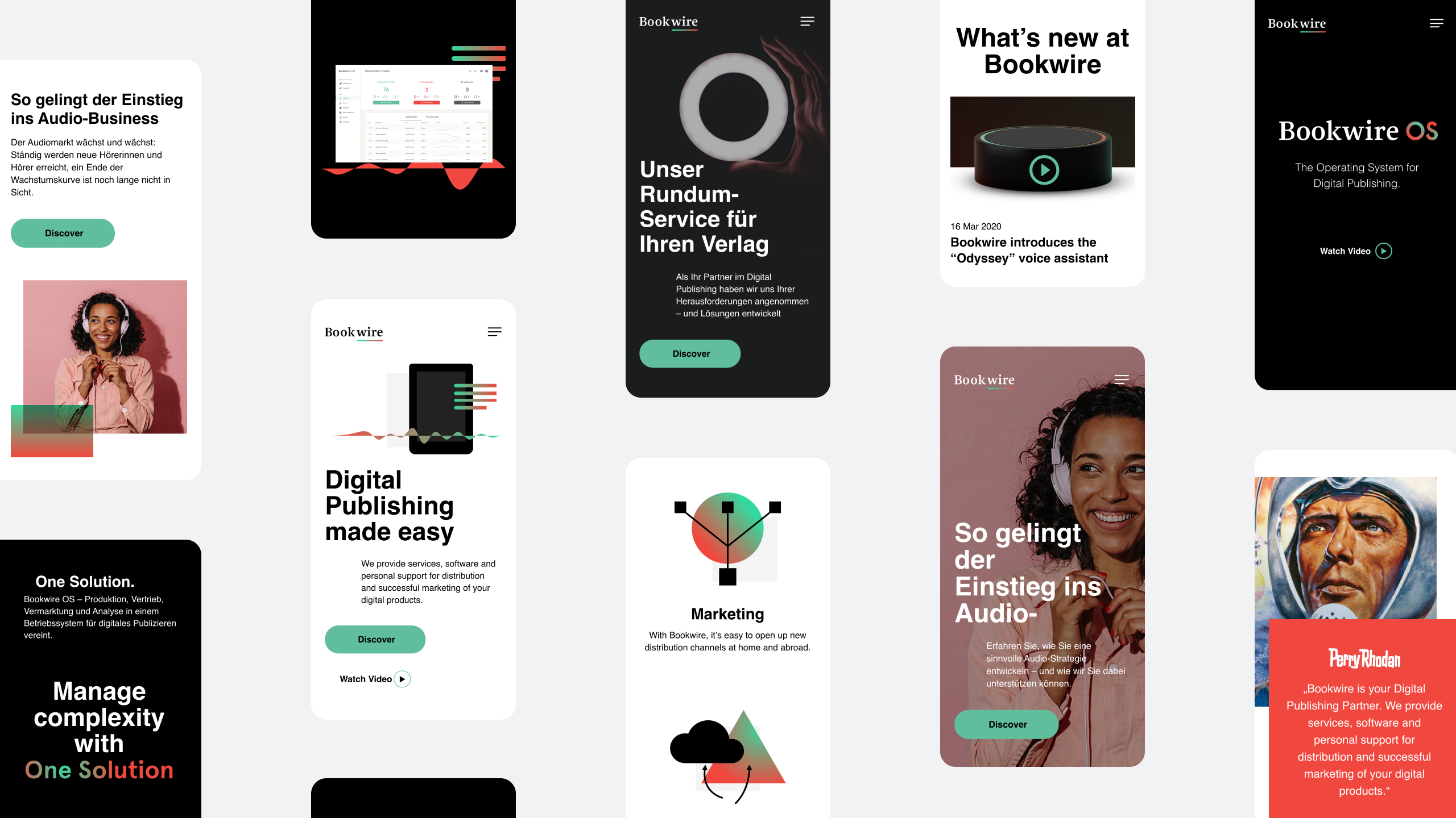
Following the wireframes designed by me and think moto’s design direction, we collaborated together in the UI design of the responsive website. We employed scrolly telling and parallax animations showcasing the new graphical elements of the new identity.
The new graphic language
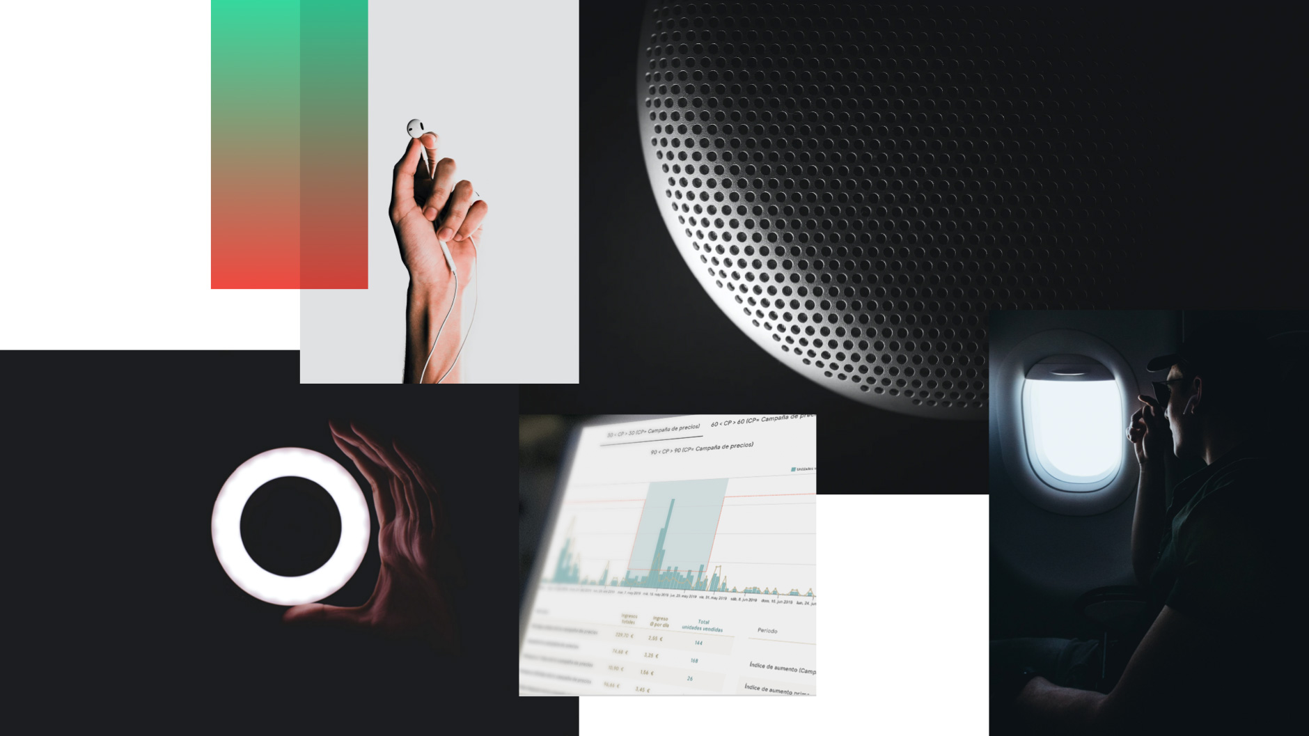
Abstract, geometric & emotional
Together with the new website it soon became clear the company needed a confident and distinct graphic style and imagery. think moto defined the new graphic language, playing with abstract geometric forms and narrative elements that can be used to emotionally visualize abstract processes. A strong black and white contrast, used alongside a striking red and green gradient, supports the new, independent look.
The app design
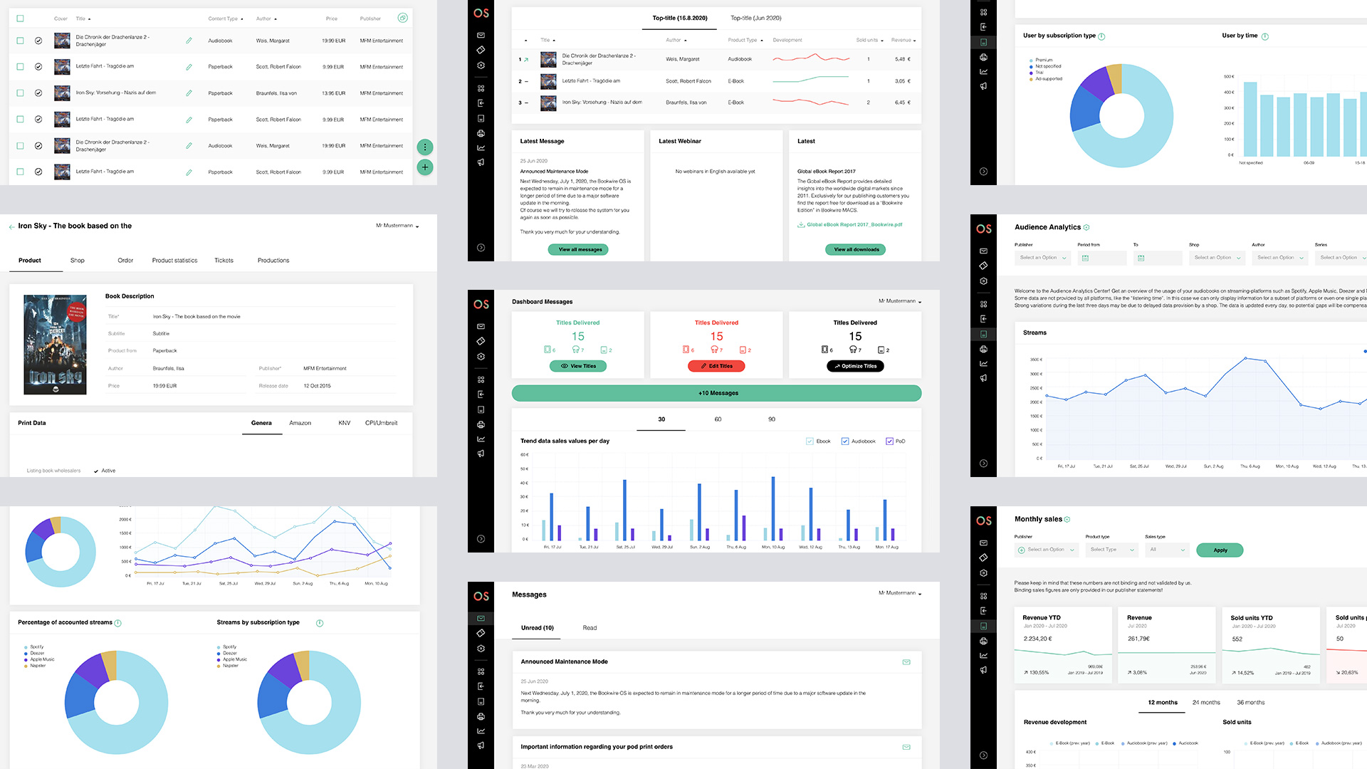
Introducing Bookwire OS
Following the design of the Bookwire website, the Bookwire OS app interface followed. After a UX audit session, we determined what UX changes would be implemented and focused primarily in the update of the new identity and a fresh UI design.
The app UI design was implemented with all the new graphic elements and design direction already implemented by think moto for the website.
Let's collaborate
hello@naiaraodriozola.com
Copyright © 2026
Development
Made with Semplice
by Naiara Odriozola