Cognigy
Software
2020
Designing the Interface for the N1 Leader in Conversational AI
Art Direction
User research
Brand Design
App Design
UX/UI
Design System
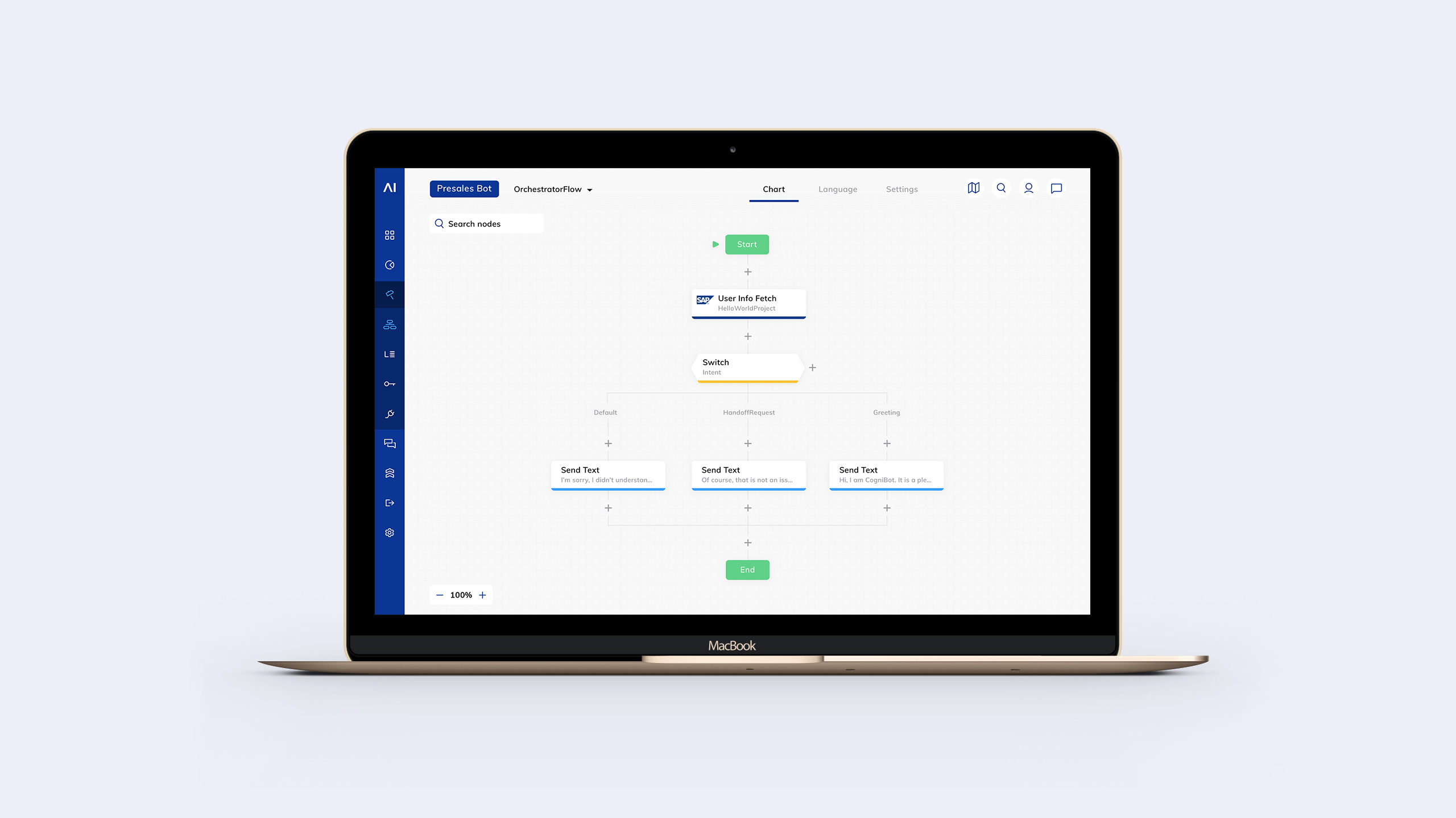
Cognigy.AI
App design Germany
Credits
Art Direction Naiara Odriozola
Head UX/UI Design Naiara Odriozola
Junior UI Design Paul Kriszan
Agency think moto
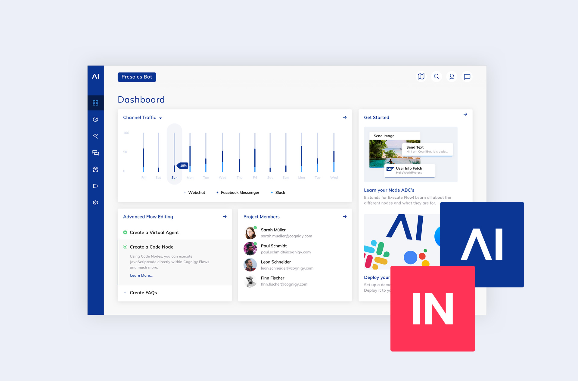
Cognigy is an enterprise software provider for Conversational AI automation. The platform, Cognigy.AI automates customer and employee communications. Its goal is to enable companies to create smooth human-like conversations with their users on any channel – webchat, SMS, voice and mobile apps.
We were commanded to rebrand and redesign the Cognigy.AI platform and update it with its new functionalities. It made us very excited about this project and to accompany Cognigy on their journey from a startup to an enterprise-level SaaS, like Google Dialogflow and IBM Watson. This evolution should be reflected in the design.
The user experience
Turning our user's wishes into new features
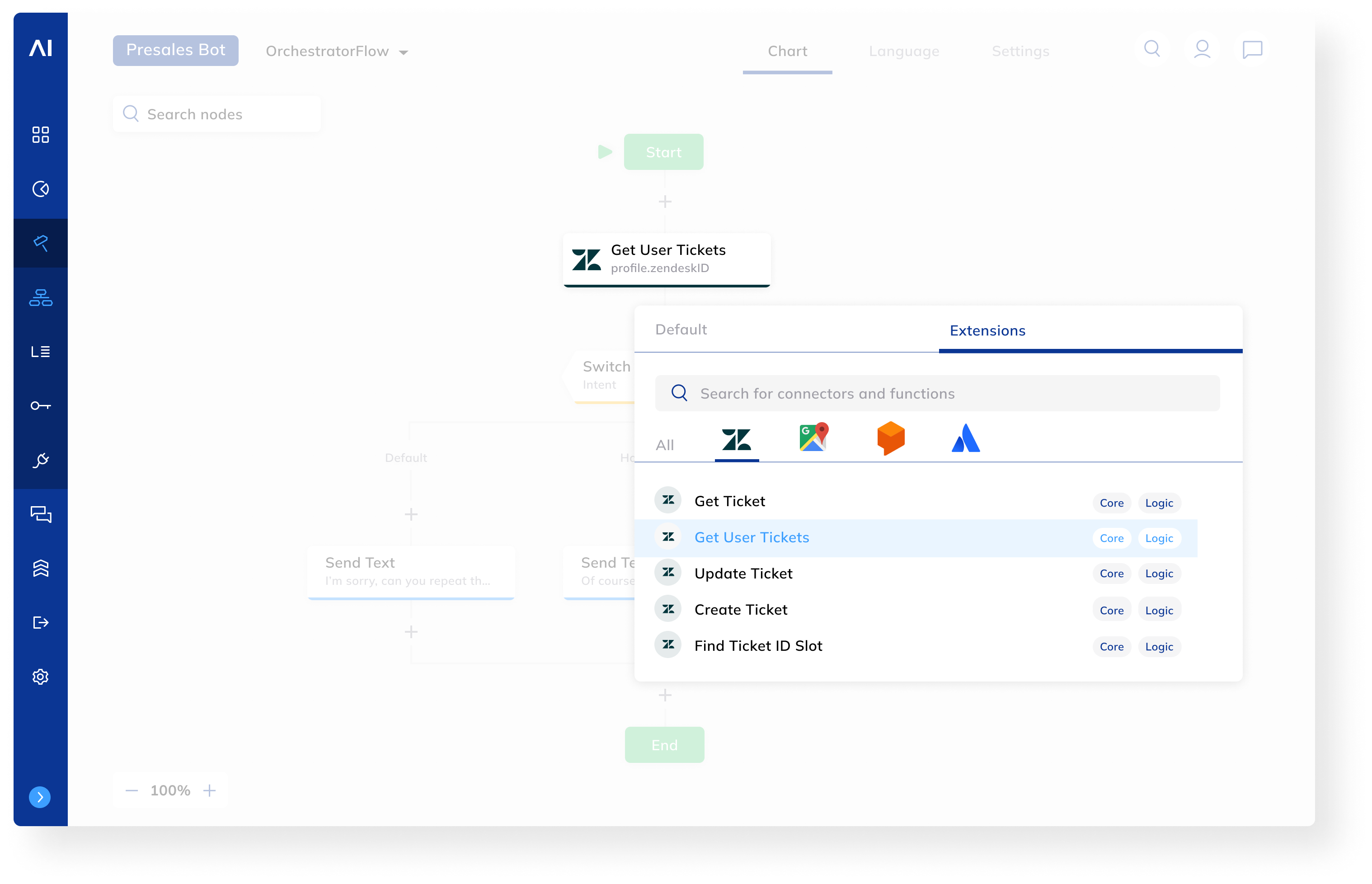
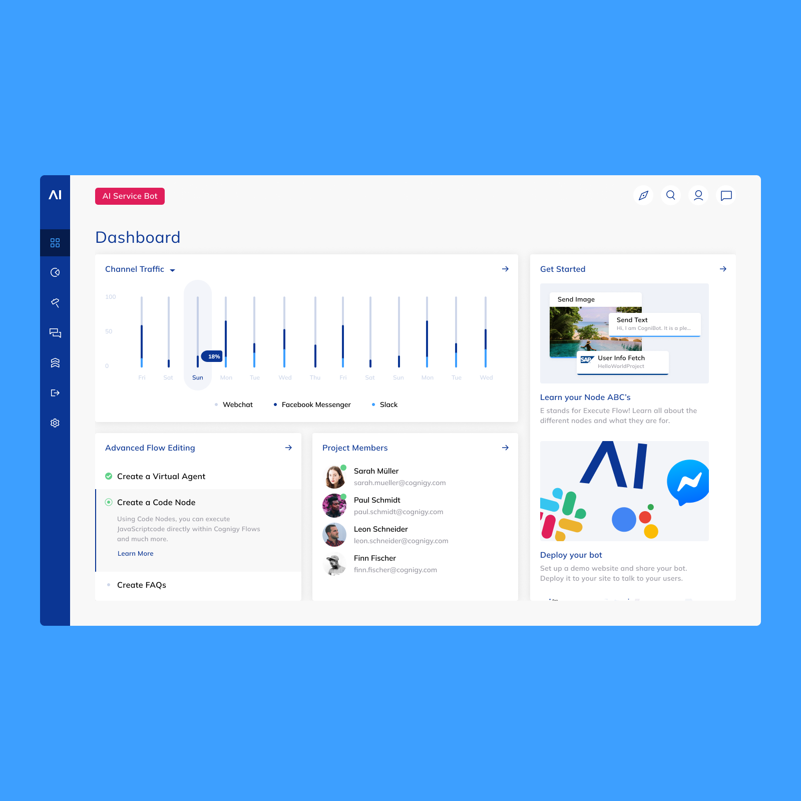
The previous Cognigy.AI experience relied on rigid structures with limited opportunity. The UX strategy consisted in building a new, flexible architecture that integrated with the existing infrastructure and enabled the new features Cognigy required to evolve as a software.
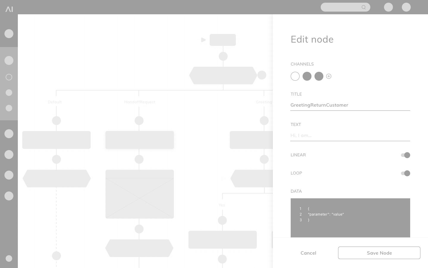
After a discovery workshop with our clients where we gathered all valuable input from both stakeholders and users to start the UX/Design Sprint. We turned this requests into flows, which we then transformed into full wireframes. The guiding principles of this sprint were to create a seamless experience by collecting all previous problems and implement new features requested by the users.
The user experience
Our customers become smarter
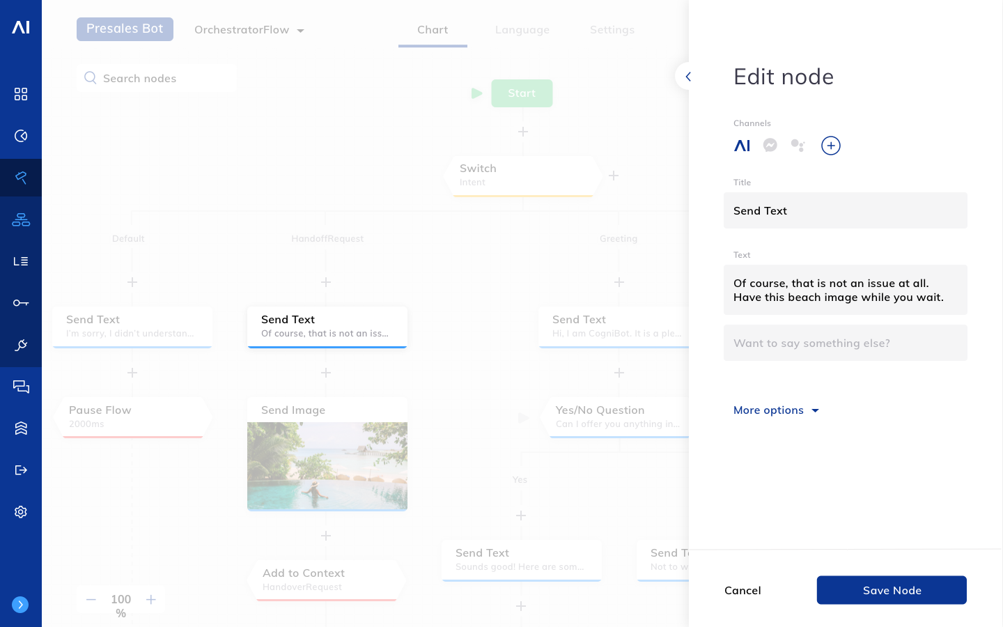
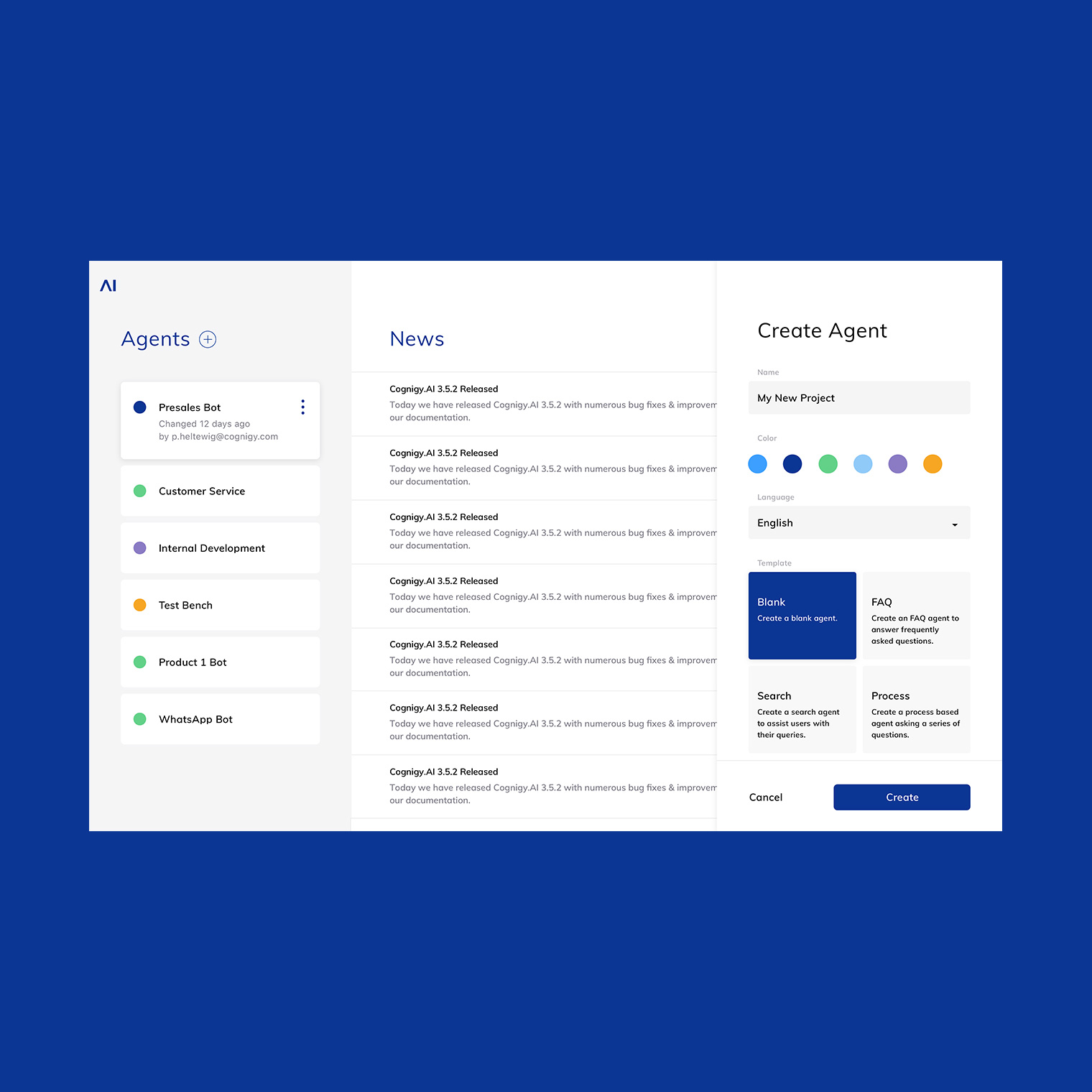
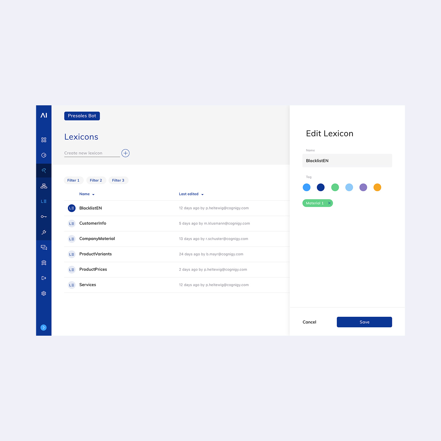
It was also important to ensure a more user-friendly navigation of the platform. The new features had caused the user interface to become larger and more complex. We integrated them into the navigation to be easily found and also reworked the node-based logic.
As a result, the new UX logic allows customers to get smarter about their own internal systems, helping create efficiencies and improving overall their business performance.
The branding elements
Defining the visual direction
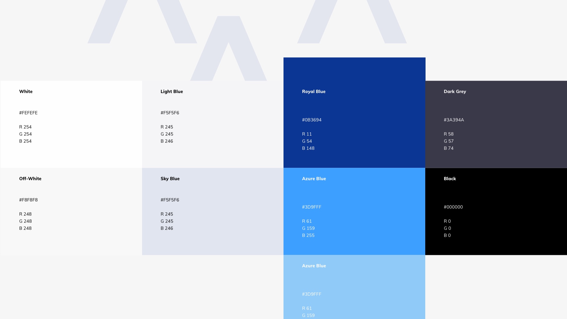
The goal was to make Cognigy appear more serious and mature whilst keeping its modern tech feeling. I set of artboards were developed for our client to set up the direction of the design we would follow.
To convey the new designs we decided for a bolder and lighter color palette and a accessible minimalistic typography. Together with the general styles and look and feel, we developed a set of logos for the different softwares Cognigy offers as well as a new set of icons.

The user interface
Defining the visual direction
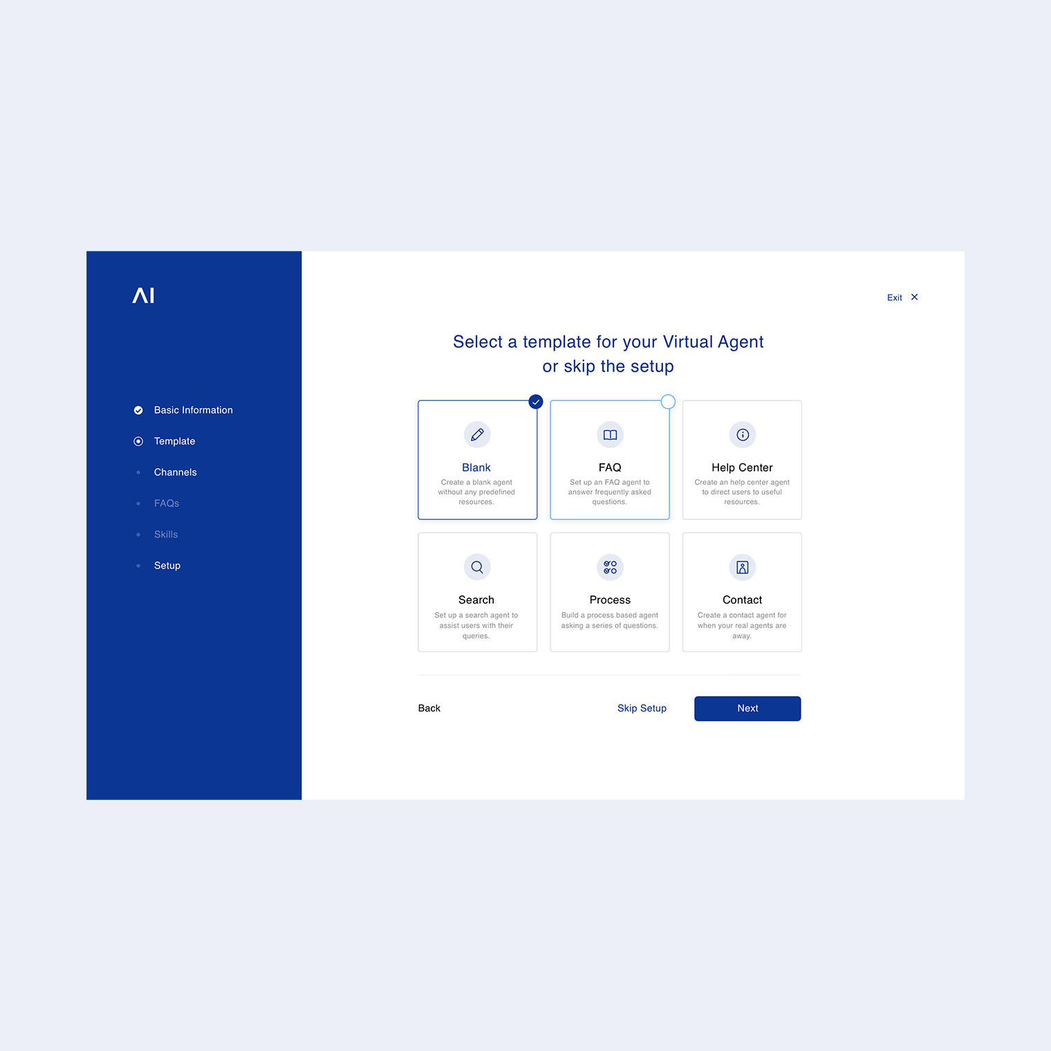
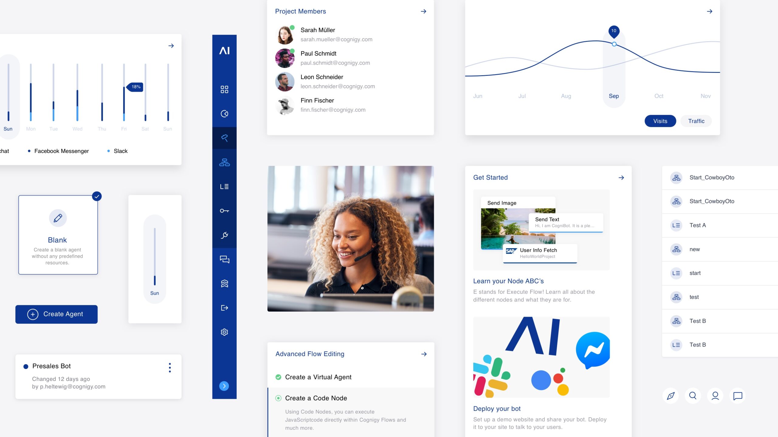
In some cases, we refreshed the look and optimized the user experience based on the customer feedback. But in others, we tackled the problem from the ground up to simplify the over-engineered experience. Cognigy is complicated, but it shouldn't feel that way. Its users come from diverse backgrounds and some may not be as digital fluent as the others. We made sure everybody has a fair start.
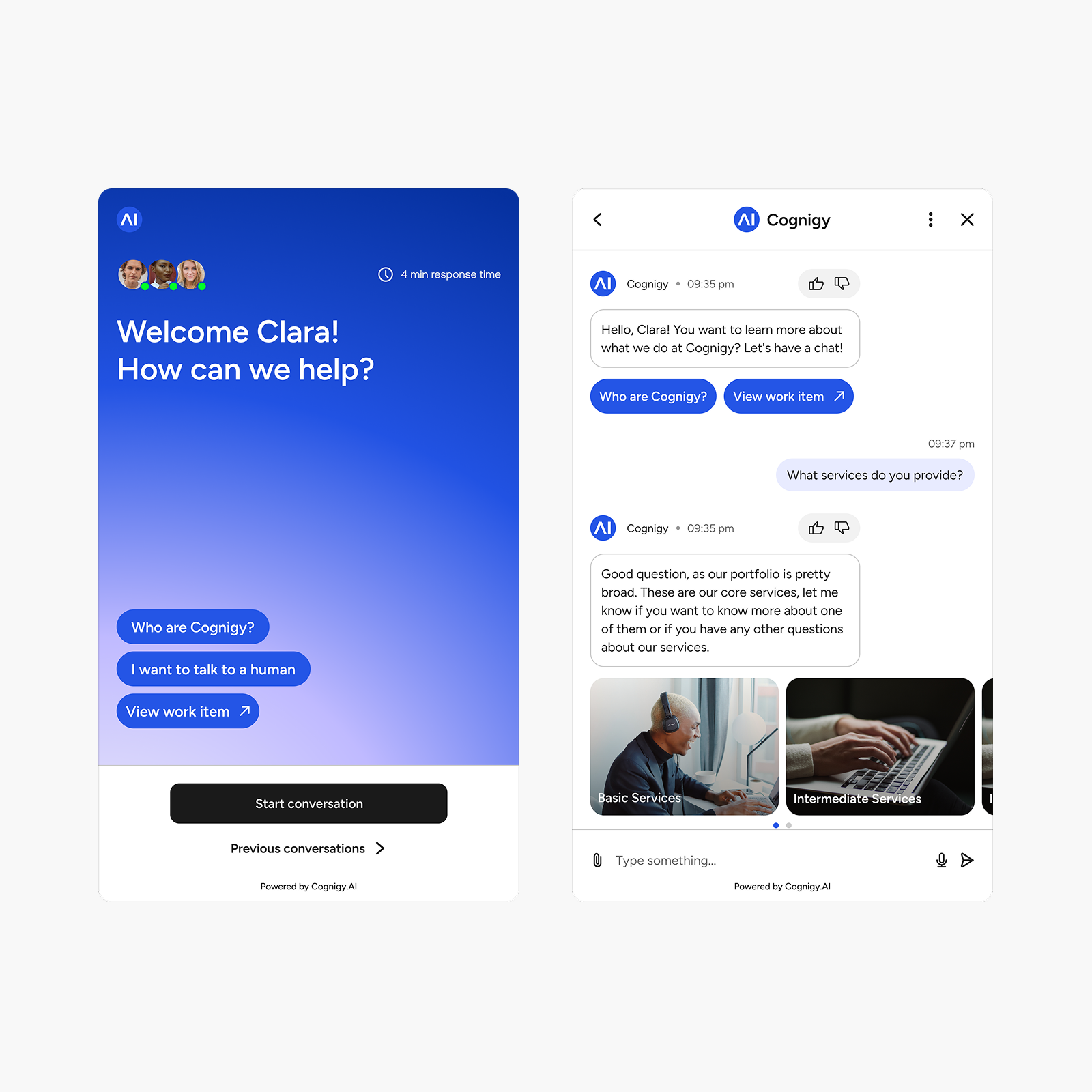
The main goal of the redesign was the improved customization to fit customer brands more closely as well as the inclusion of more recent technologies, such as generative content and synthetic avatars. At the same time, we gathered the main branding elements to create a small design guideline for the mvp.
The Design System
Defining the atomic design
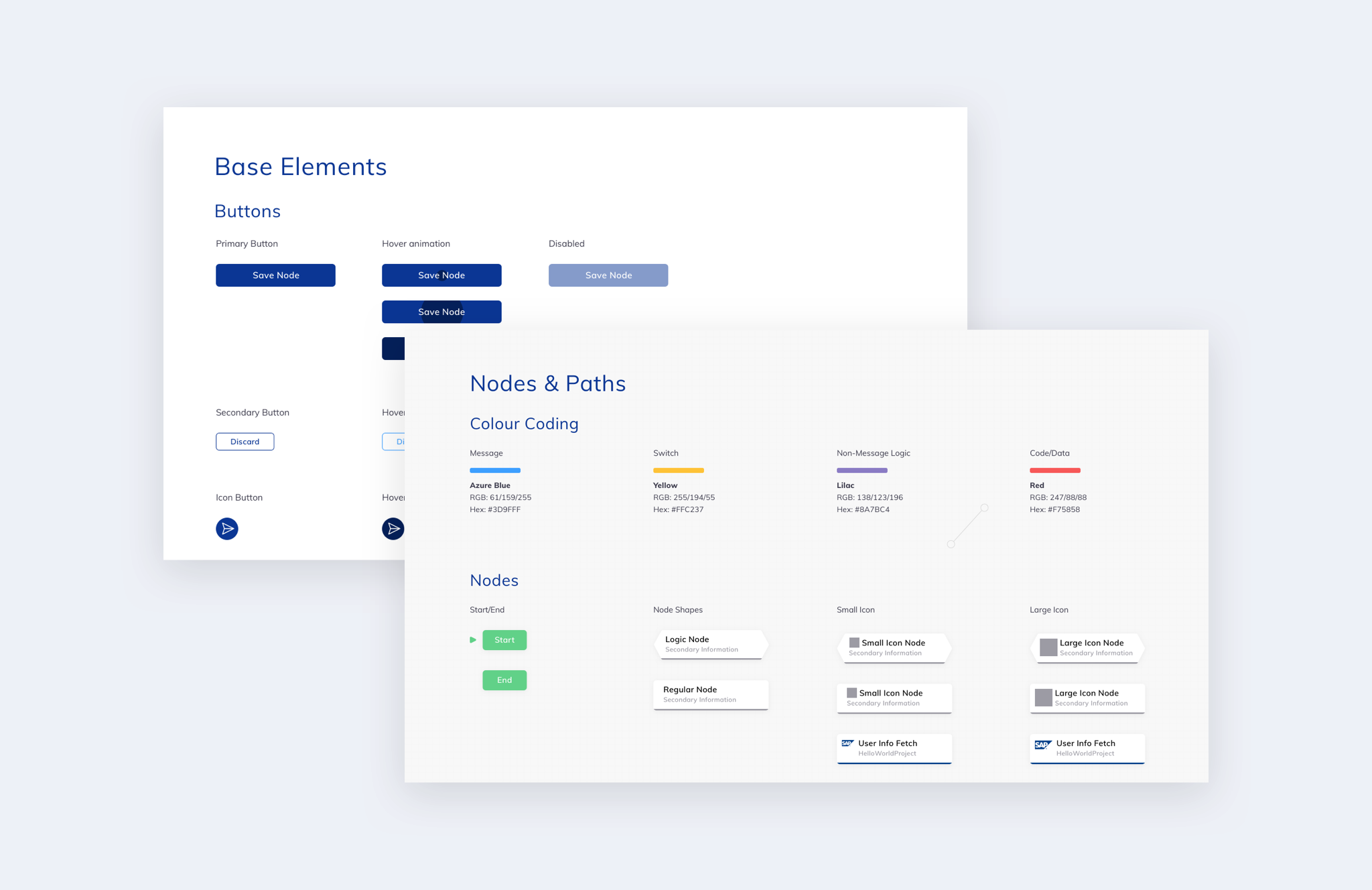
A further Design System with micro-animations completed the package that was handed to the development team. As the app will continue to grow with more functions in the future, we designed the interface using a module system that can be expanded whenever necessary.
We had the advantage that we knew the tool and it’s strengths and weaknesses inside-out and were happy to make future projects easier for ourselves by improving the usability and intuitiveness of the node-based editor and other core features.
Cognigy's Continued Innovation
Shaping the Future of Customer Interaction
Subsequent projects for Cognigy included the development of a product and naming system as they expanded their feature set, and the redesign of the out-of-the-box webchat widget, that a lot of their customers, such as Lufthansa and Allianz, were using with until then limited capabilities of customization.
Thanks to the Cognigy AI redesign, we were able to provide advanced customization options that more accurately reflect each customer’s brand, all while incorporating the latest technologies for improved performance and flexibility.
Let's collaborate
hello@naiaraodriozola.com
Copyright © 2026
Development
Made with Semplice
by Naiara Odriozola