Mana
Yerba Mate
2024
Awwwards Masterclass project for the revamp of the Mana website
Art direction
Concept
Visual Strategy
UX/UI
Animation
Prototyping
Mana Yerba Mate
Web Design Remote
Masterclass Project
Teaching Louis Paquet
Art Direction Naiara Odriozola
Visual Design Naiara Odriozola
Animation Naiara Odriozola
Content Mana Yerba Mate
Last year, I took part in the Memorable UI Design for Interactive Experiences Masterclass led by Louis Paquet. It was a deep dive into the full web design process, from first ideas to final execution—and the result was the Mana homepage, shaped by every step of that creative journey.
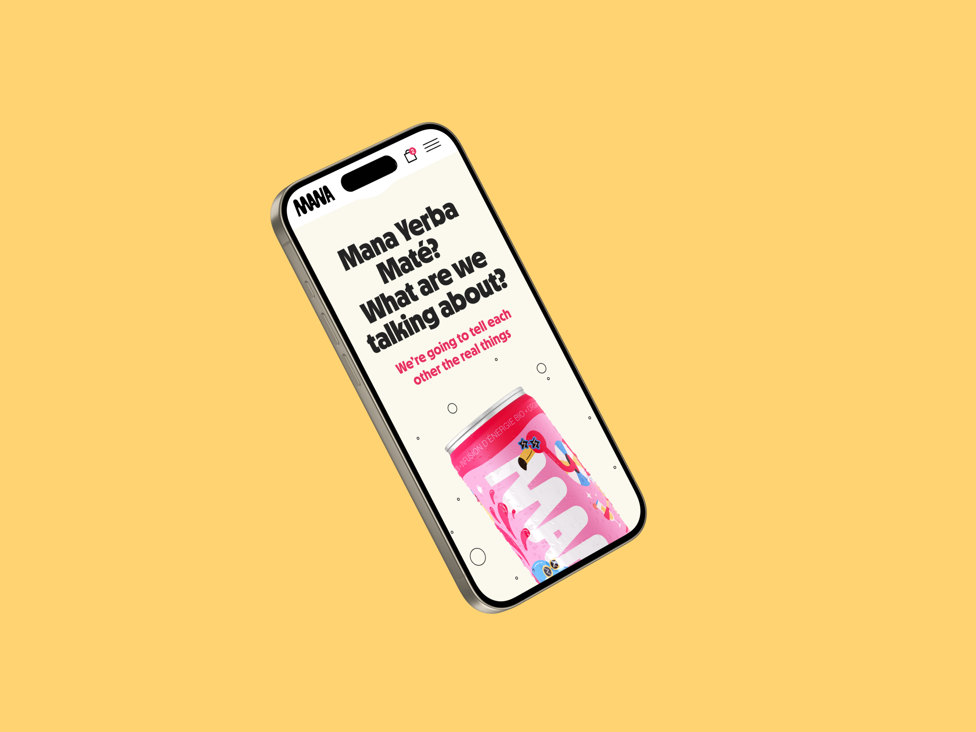
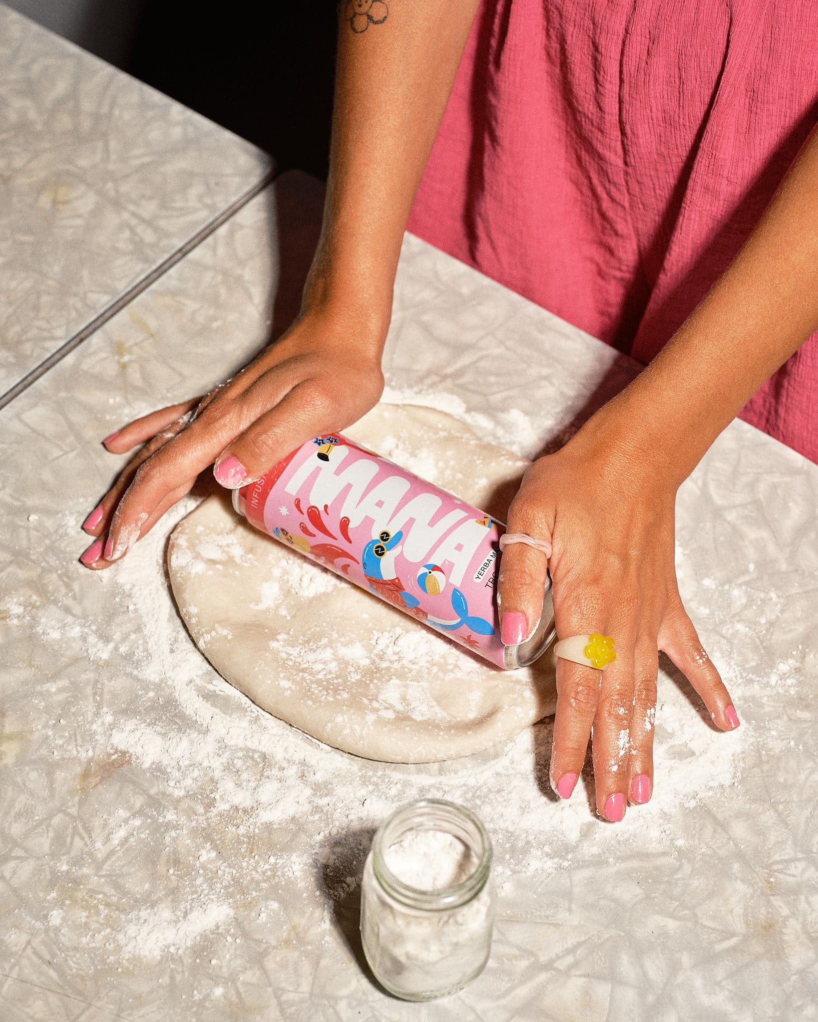
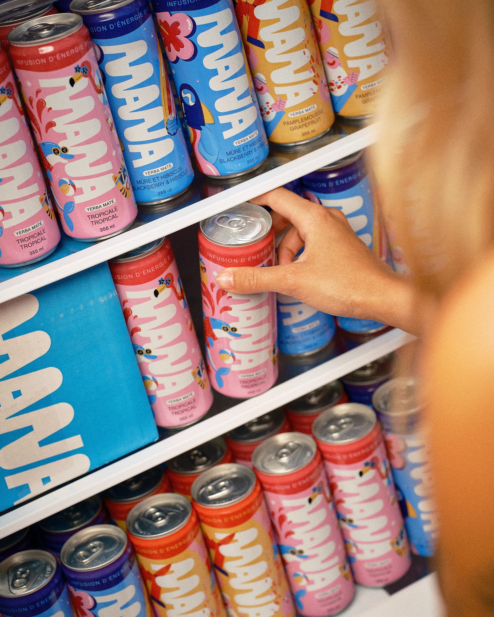
Mana is a Montreal-based brand making organic Yerba Mate energy drinks. While most brands highlight the health benefits, Mana wanted to stand out by emphasizing the energy boost and fun side of their product. For the website, it was essential to capture this vibrant, energetic spirit while keeping it functional and user-friendly.


The identity
Fun and dynamic energy
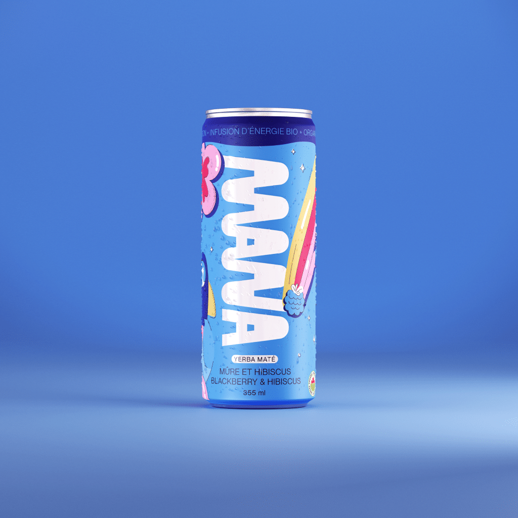
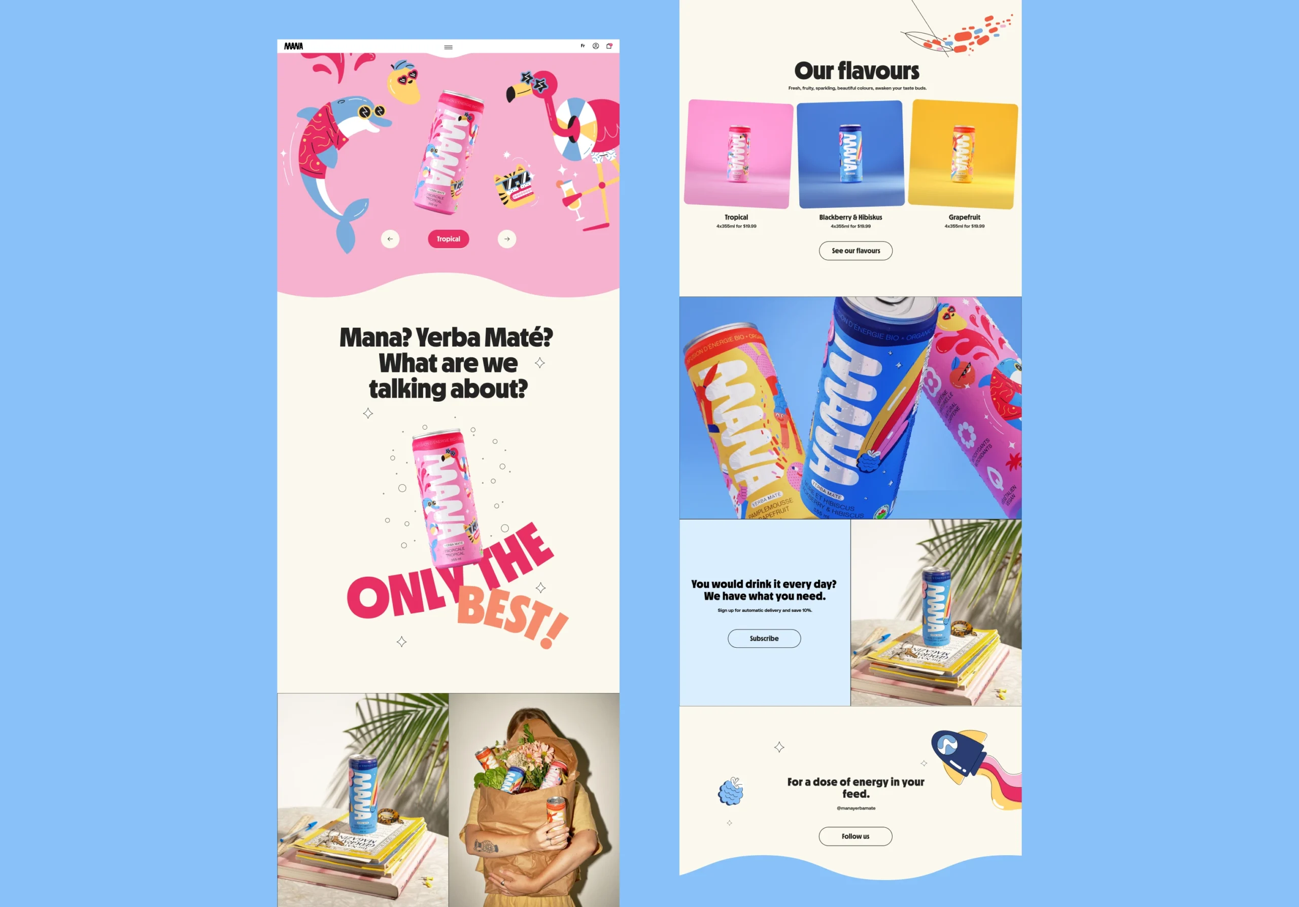
My concept for Mana's website takes inspiration from waves and liquid, incorporating smooth, rounded elements, wave-like patterns, and lively animations. I chose a bold, character-filled font to capture the brand's fun and playful essence. The product colors are used as pops of accent, set against a soft beige background that creates a serene, open space.
The entire design unfolds in a lively, colorful graphic setting that reflects Mana's one-of-a-kind style, with each flavor represented through its own distinctive visual theme and color scheme.

The user experience
Immersive product discovery
The homepage functions as a portal for exploring and purchasing the brand’s wide range of flavors, while also raising awareness about the lesser-known benefits of Yerba Mate.
Rather than presenting products through a standard technical sheet, we brought them to life with rich visuals and seamless transitions—turning even the more conventional elements into something engaging. Here the focus remained firmly on the user and their experience.

The visual design
Fueling fun with an harmonious balance
Mana wanted a digital experience that was not only highlighting the healthy aspect of the brand, but also had a fun and modern look to attract the fitness and energy boost market.
We centered the design direction and story telling in highlighting the unique personalities behind every flavor through bold fonts, vibrant colors, and playful animation.
Let's collaborate
hello@naiaraodriozola.com
Copyright © 2026
Development
Made with Semplice
by Naiara Odriozola