Continental
Next-gen tires
2022
The reboot of the Continental tires website
Vision & Strategy
UX research
Branding
Visual Design
Interaction
Animation

Continental
Web Design Global
Credits
Creative Direction Markus Kleine-Vehn & Katja Wenger
Head of UX Design Naiara Odriozola
Visual Design Markus Kleine-Vehn & Naiara Odriozola
Animation Sarah Latka
Agency think moto
For 150 years, Continental has been building tires that grant people trust, reliability and safety. Amidst a global pandemic, Continental embarked on an ambitious project to transform its business. The goal was to turn a traditionally very product-centric organisation into a human-centric organisation.
The brief: Create a more human-centric Continental Tires website, redesigned from the ground up to fit how people educates themselves and purchases tires.
Working together, we created an immersive digital experience where we put our users' requirements first. Presenting this way an offer with fast and smart products and solutions which will differentiate the brand from emerging competitors.

The user experience
Bringing the brand experience to the screen
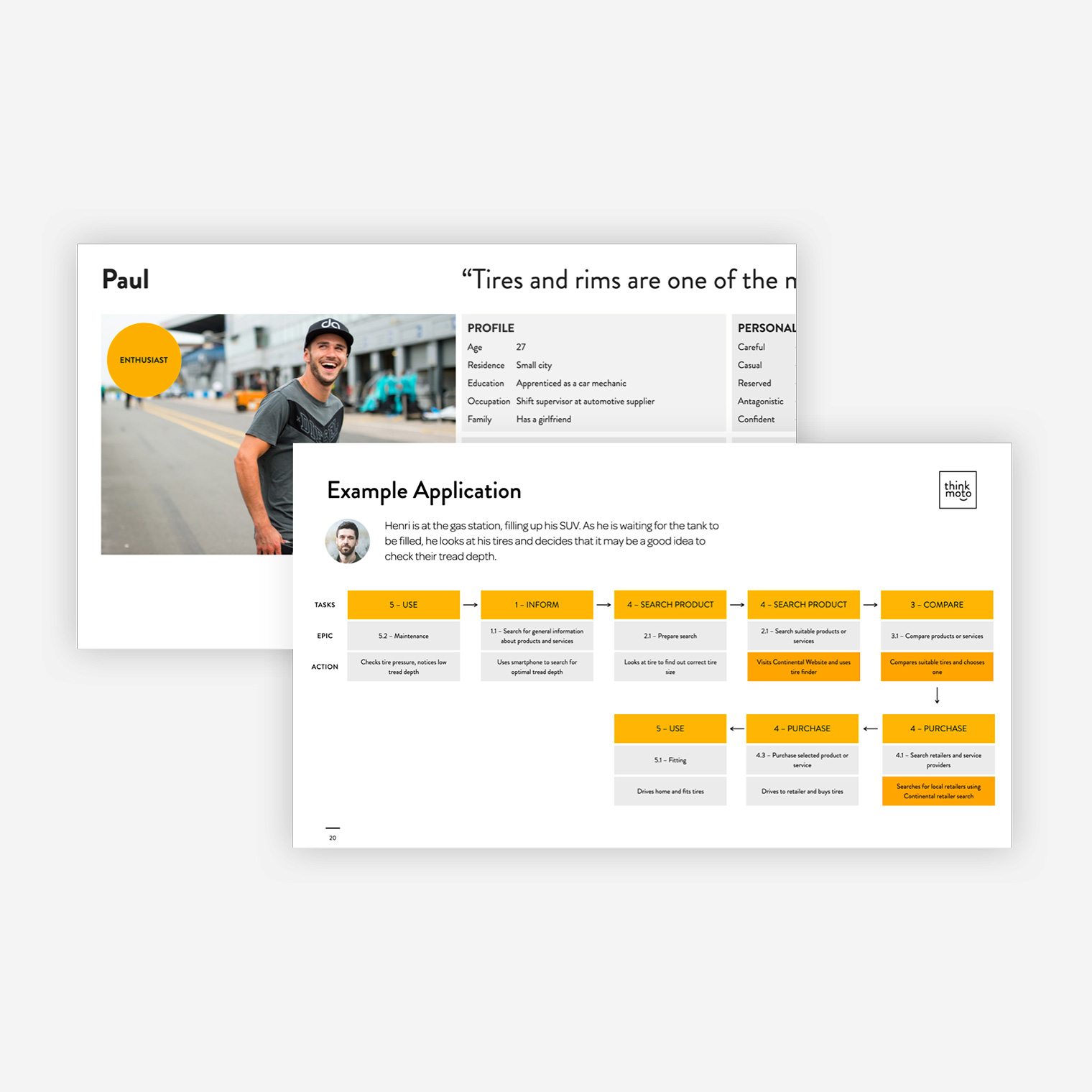
After conducting a series of interviews with Continental's customers, retailers and fleet managers, we soon realised that users didn't primarily visit the Continental website to buy tires, but to inform themselves to take better purchase decisions, find information about brand and innovation topics and to compare between different products and services.
To further understand our users' needs, experiences, behaviours and goals we created user journeys and personas. Following the information gathered, we decided that the product pages wouldn't take an e-commerce focus, but instead a more emotional, supportive and minimalistic approach. This would guide our users, enhance engagement and improve their purchase decisions.
The new brand guidelines & Moodboard
Innovative, supportive & experienced
Continental developed a new set of brand guidelines to improve brand awareness and marketing strategies. Following our discovery workshop with the client, we realised that it was key to present our products in a clean, simple and straightforward manner and this way support our users in their decisions.
To support our vision, we created moodboards that would guide our design process and help implement the new brand guidelines into the website redesign.
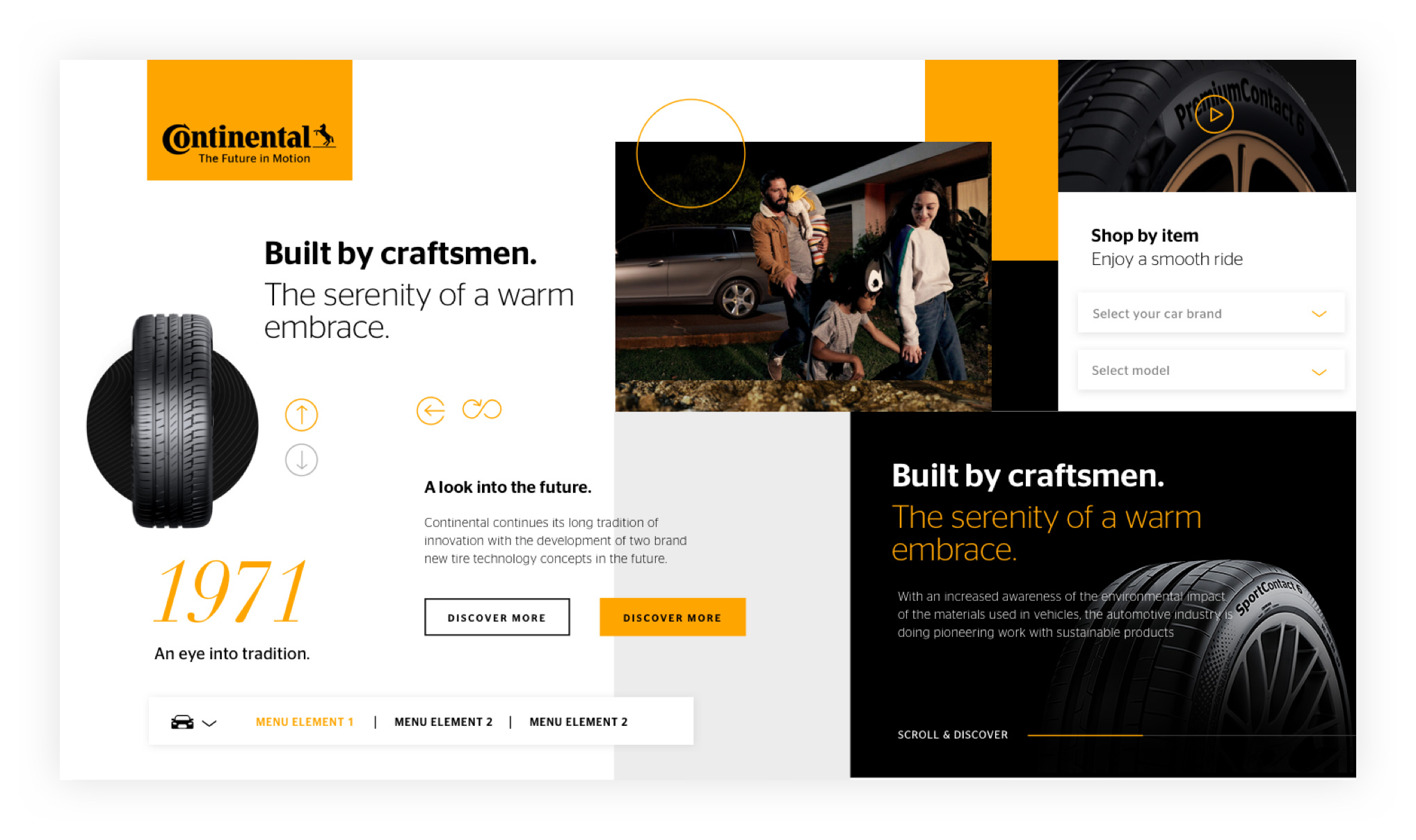
The interface design
Making tires sexy
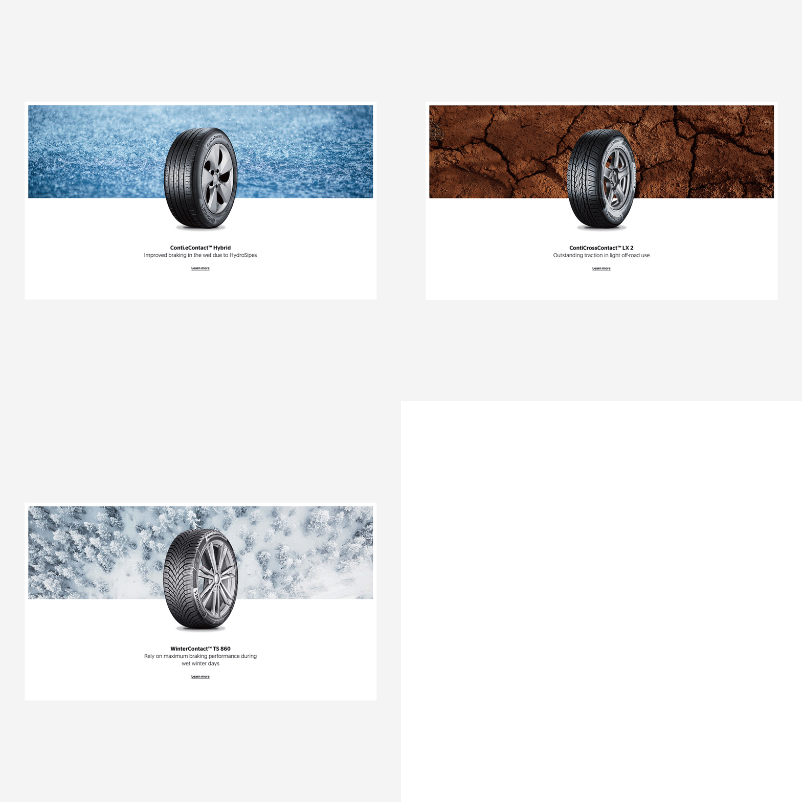
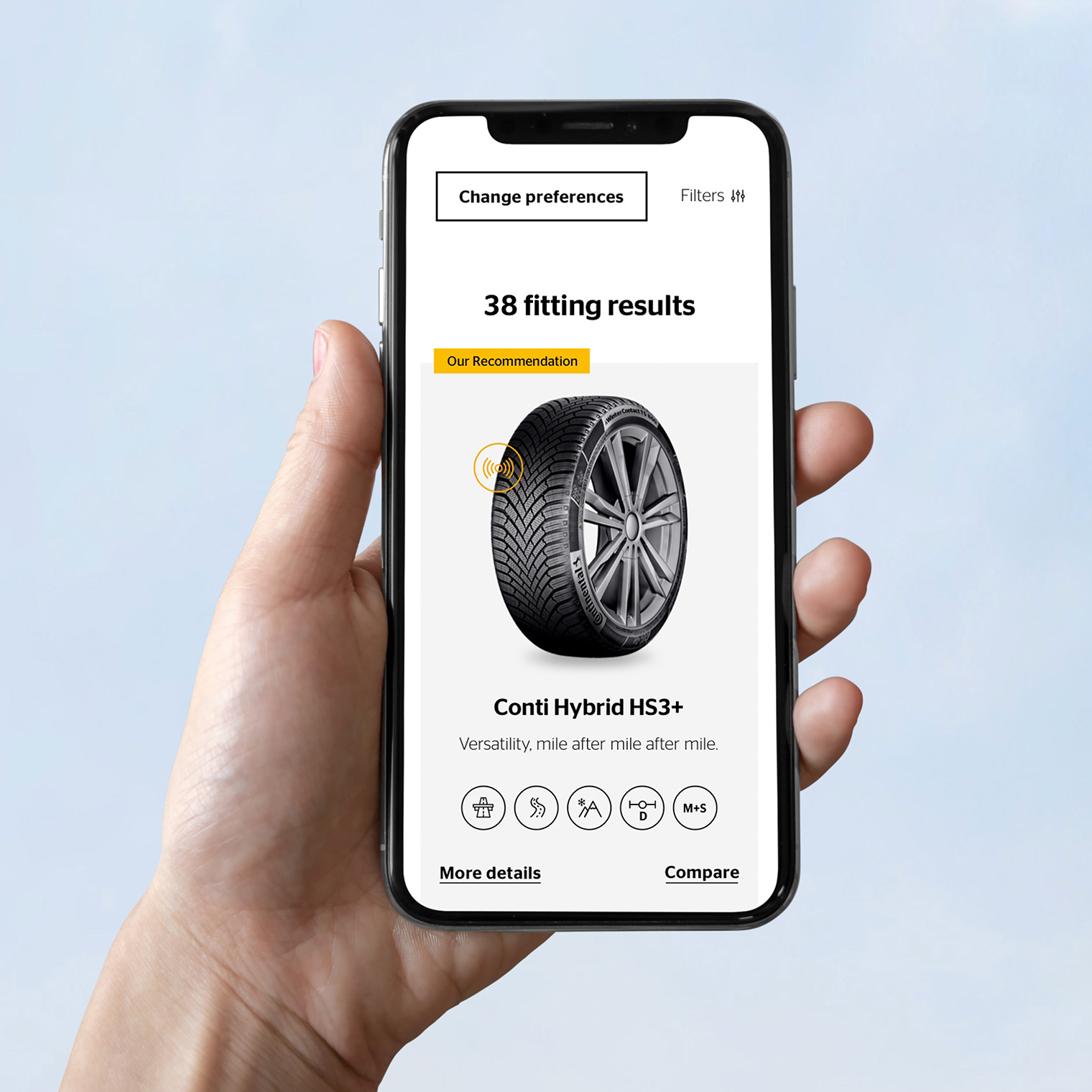
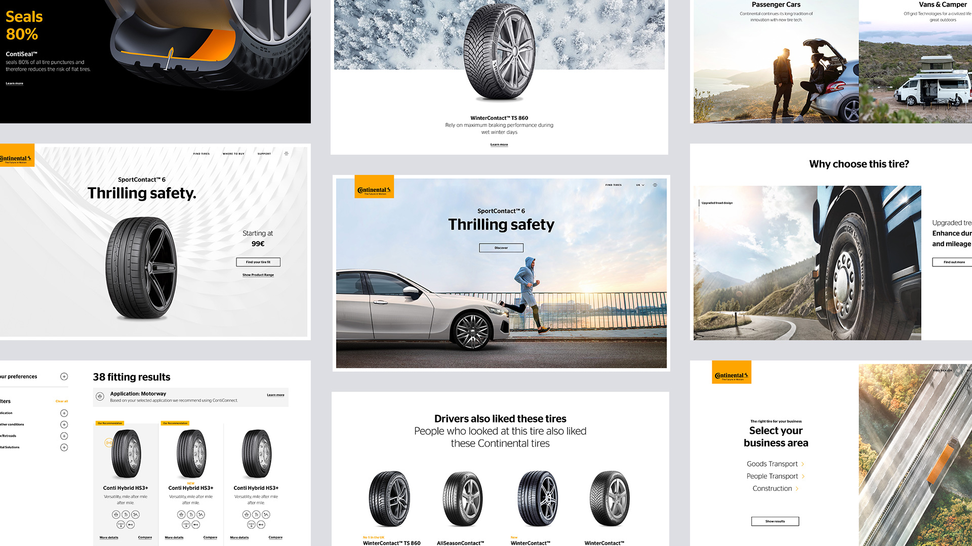
The website interface would focus on keeping it simple by using large areas of white space and big margins to focus on single areas of content.
the website relaunch for Continental tires was about presenting the tire as a sensual premium product and granting it an appropriate stage on the website. Continental's product pages feature a large product shot with single tagline and clear, bold design. The header shows how the typography can be used together with the pattern and images, and highlights how the components form a strong brand identity.
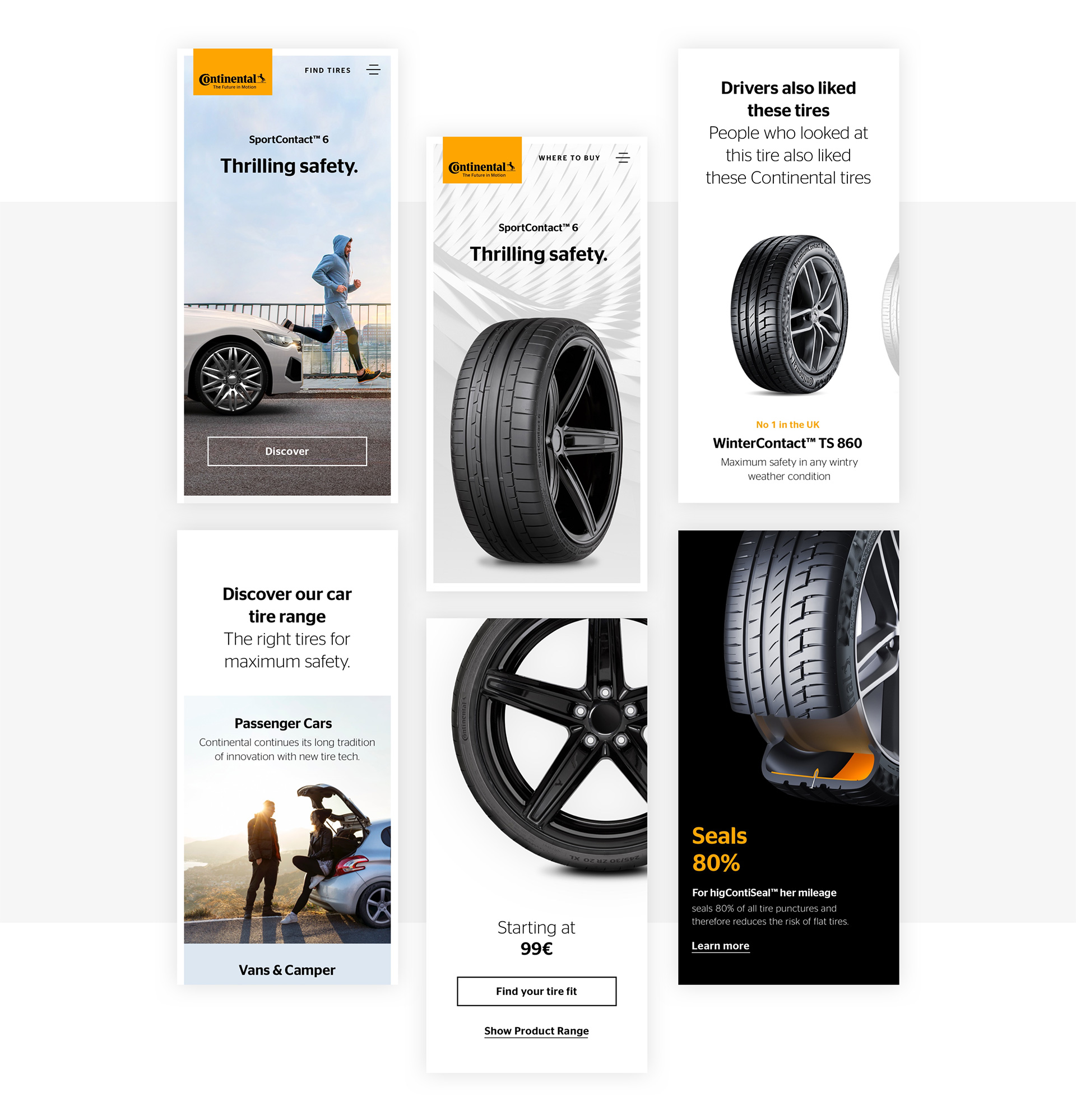
Key Results
€39.4 bn
13%
16%
sales in 2022
Profit margin from tires
increase from 2021
Let's collaborate
hello@naiaraodriozola.com
Copyright © 2026
Development
Made with Semplice
by Naiara Odriozola